Gallery
100 interactive maps built from public open data, grouped by theme.
Each is a single .geolibre.json project authored with the
Python package and shared on share.geolibre.app: choropleths,
heatmaps, clusters, great-circle flows, 3D extrusions, before-and-after swipes,
and time sliders, with click popups, hover tooltips, and a legend derived from
each layer's symbology. Click any map to open the live project, or fork it
on share.geolibre.app to make it your own.
Every project is tagged with its theme, its features (time-slider, swipe,
3d, heatmap, clusters, imagery), and
open-data,
so you can filter the gallery on share.geolibre.app by tag.
Browse the Official Demos collection
Jump to a theme: Health · Natural hazards · Climate · Oceans and water · Nature and land · Transport and mobility · Cities and infrastructure · Energy · Space and Earth observation · History and culture · Society and economy · Food and agriculture
Health
7 projects · Filter by the health tag
 |
 |
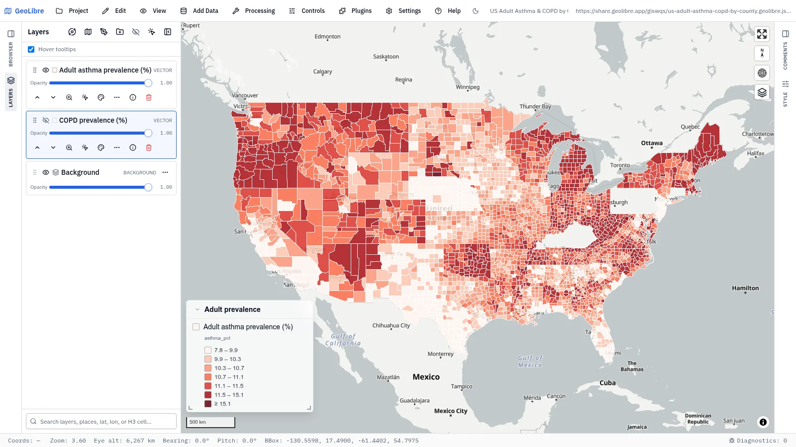
| US adult asthma & COPD Environmental health · County choropleth of age-adjusted adult asthma, with COPD one toggle away Data: CDC PLACES |
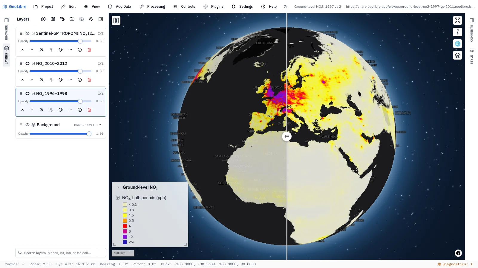
Ground-level NO₂, 1997 vs 2011 Air pollution · Swipe between two periods of satellite-derived surface NO₂ Data: NASA SEDAC via GIBS |
 |
 |
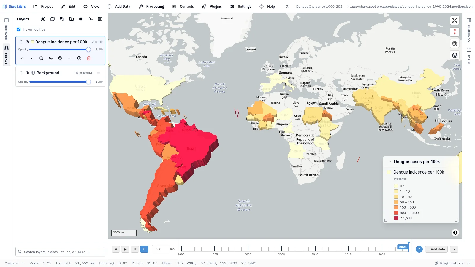
| Dengue incidence, 1990–2024 Environmental health · Time-slider 3D choropleth of reported dengue per 100k people Data: OpenDengue |
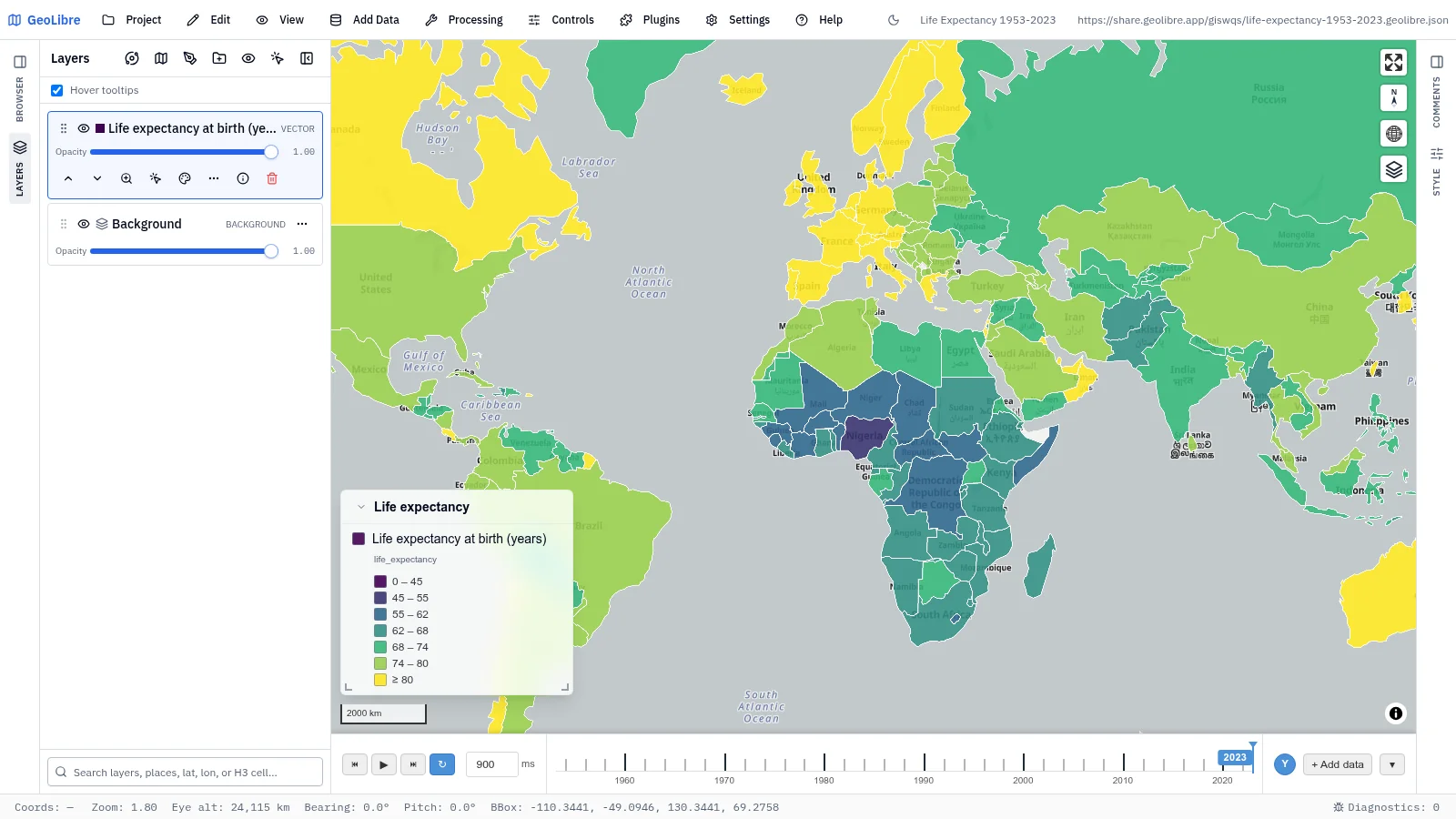
Life expectancy, 1953–2023 Health · Time-slider choropleth of life expectancy at birth in five-year steps Data: Our World in Data |
 |
 |
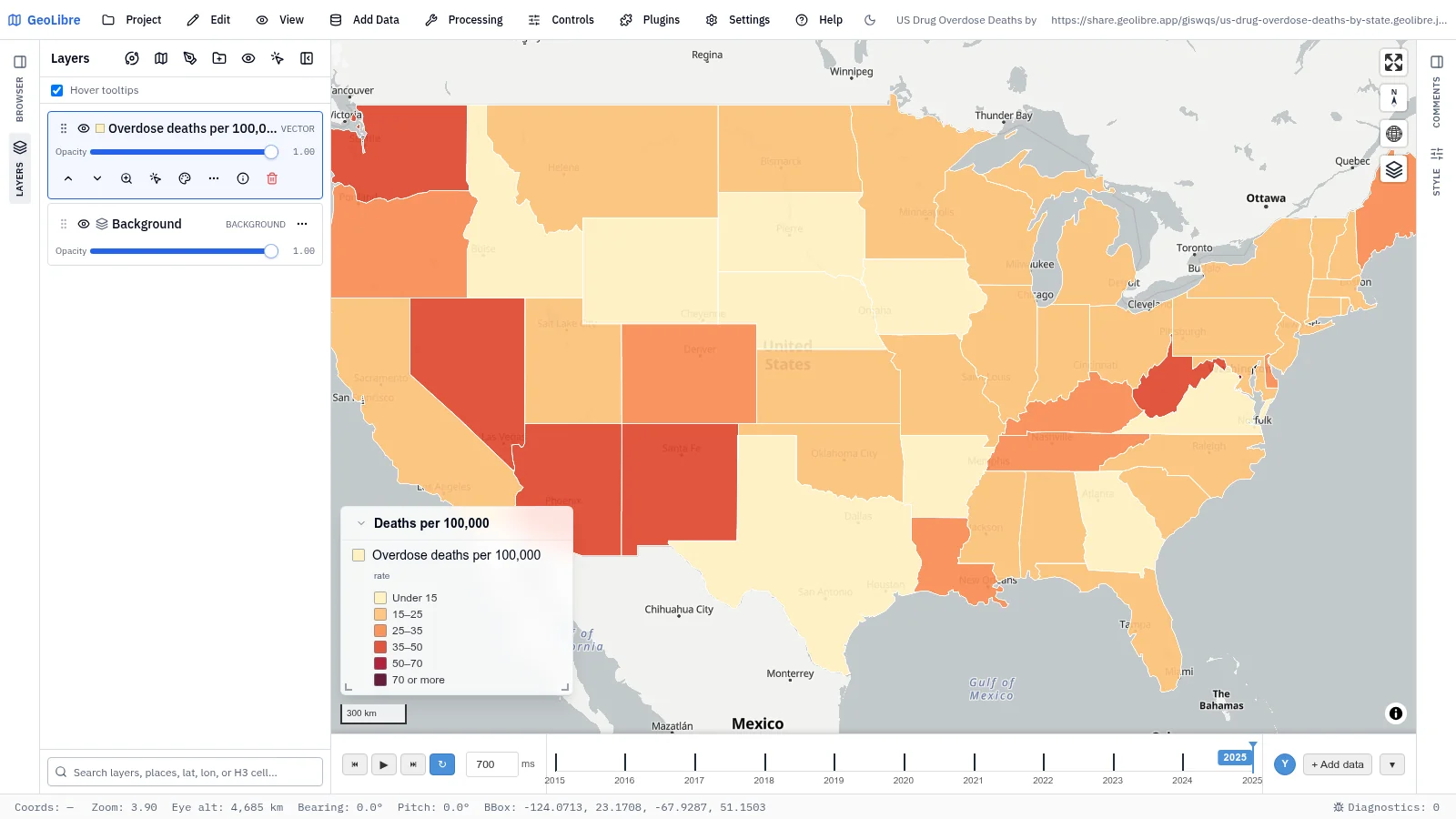
| US drug overdose deaths by state Health · Overdose deaths per 100,000 by state, 2015–2025, on a time slider Data: CDC VSRR |
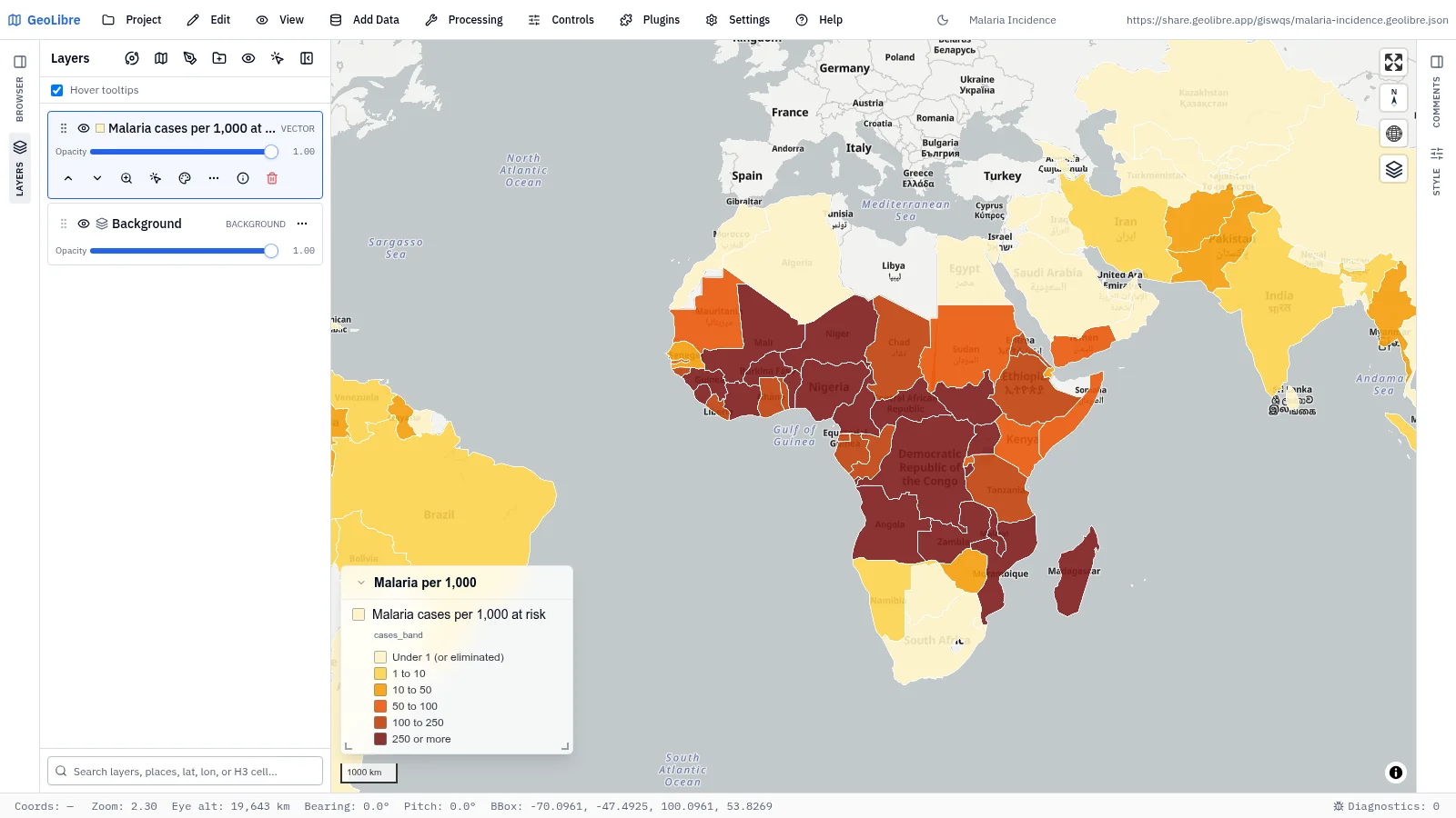
Malaria incidence Health · Malaria cases per 1,000 people at risk in 102 countries Data: WHO Global Health Observatory |
 |
|
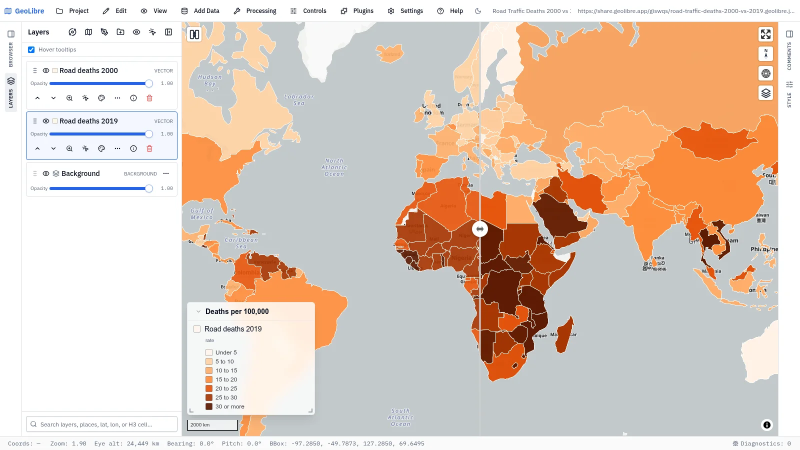
| Road traffic deaths, 2000 vs 2019 Road safety · Road deaths per 100,000: swipe 2000 against 2019 Data: World Bank (WHO) |
Natural hazards
11 projects · Filter by the natural-hazards tag
 |
 |
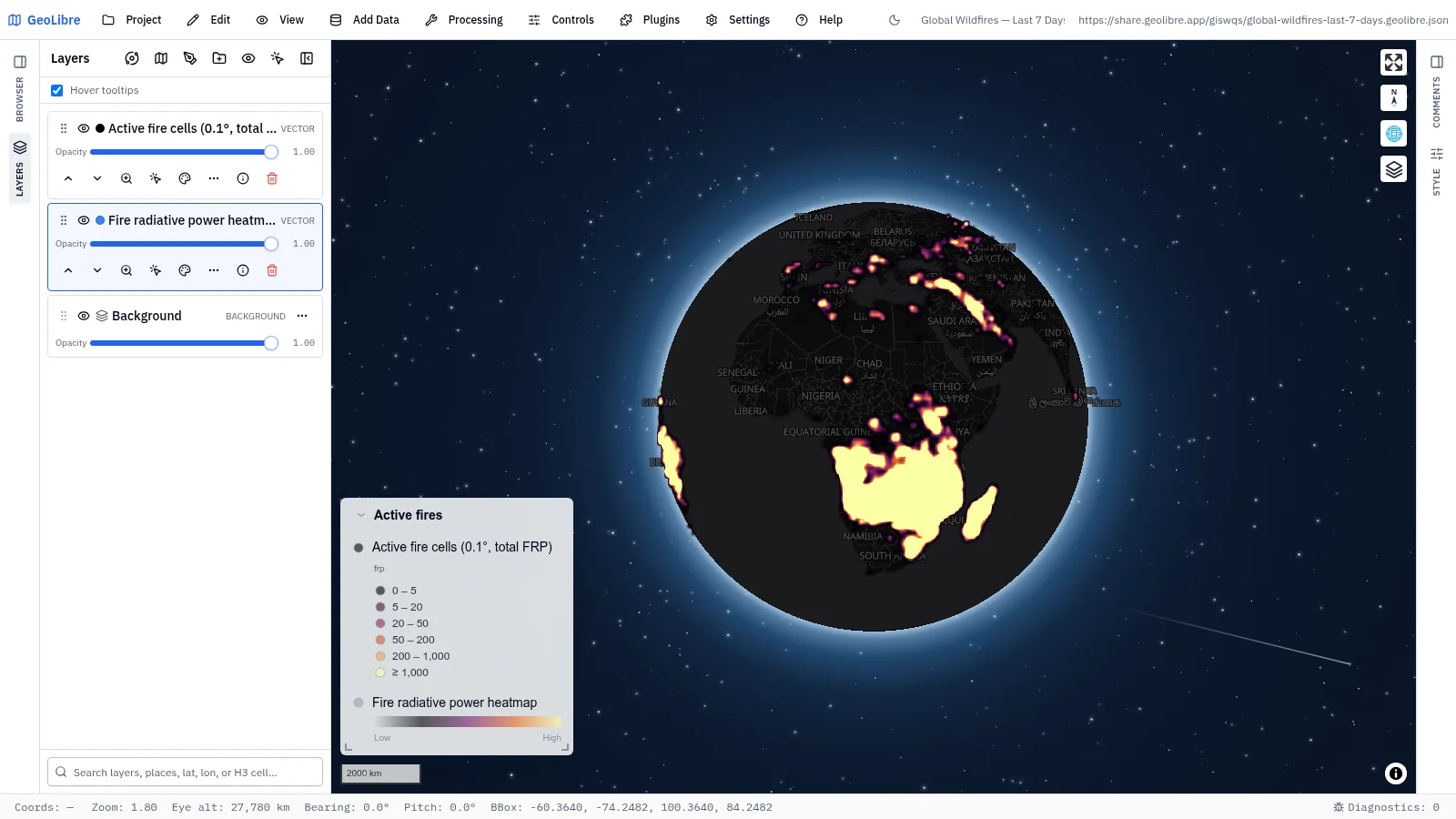
| Global wildfires, last 7 days Wildfires · Fire-radiative-power heatmap that resolves into 0.1° fire cells Data: NASA FIRMS (VIIRS) |
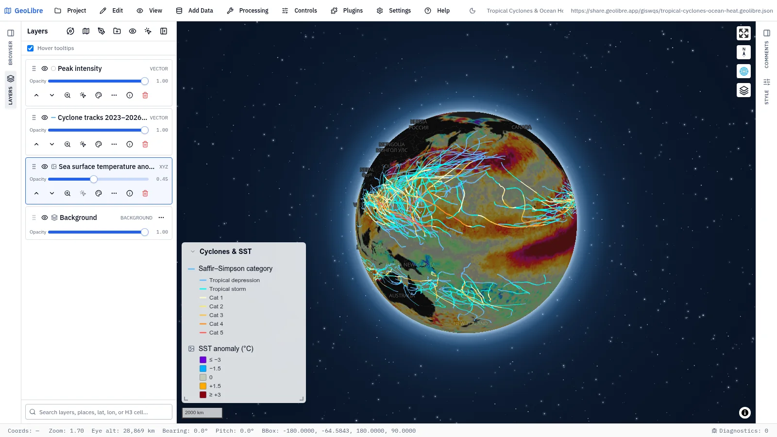
Tropical cyclones & ocean heat Climate hazards · Three seasons of storm tracks by category over SST anomalies Data: NOAA IBTrACS, NASA GHRSST |
 |
 |
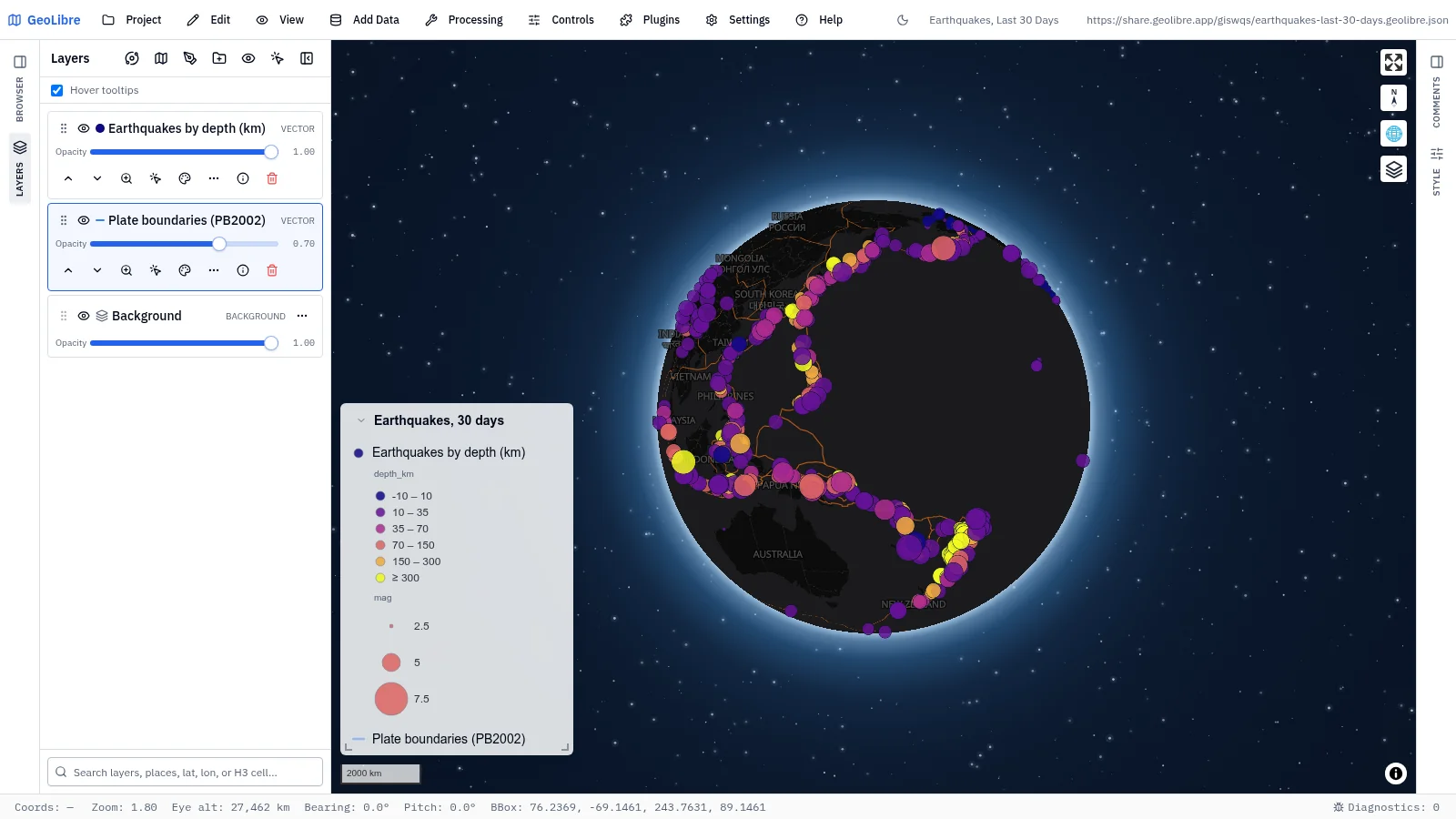
| Earthquakes, last 30 days Natural hazards · Every M2.5+ quake sized by magnitude and colored by depth, over plate boundaries Data: USGS, PB2002 |
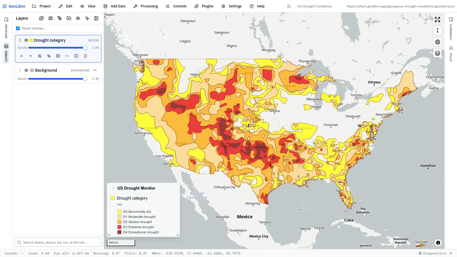
US drought conditions Environmental change · This week's drought categories, from abnormally dry to exceptional Data: U.S. Drought Monitor |
 |
 |
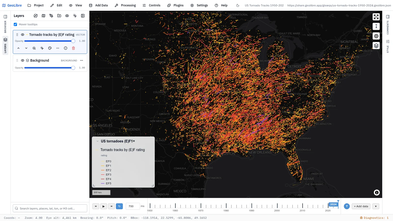
| US tornado tracks, 1950–2024 Natural hazards · (E)F1+ tracks by rating on a time slider that accumulates year by year Data: NOAA Storm Prediction Center |
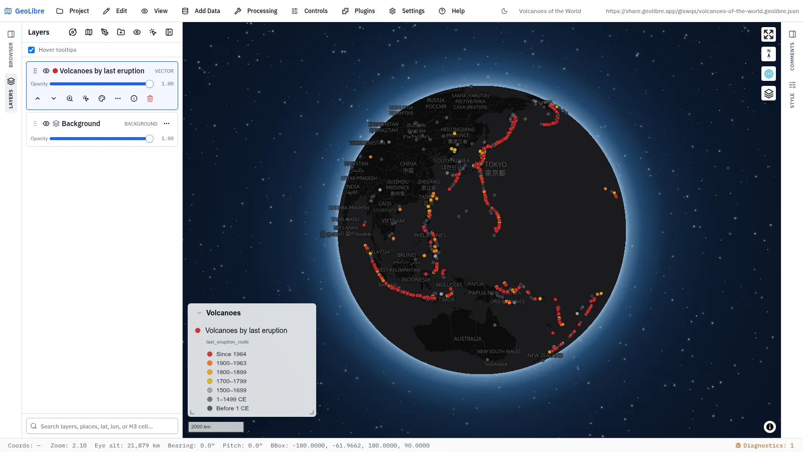
Volcanoes of the world Natural hazards · Holocene volcanoes colored by last known eruption, labeled from zoom 5 Data: NOAA NCEI |
 |
 |
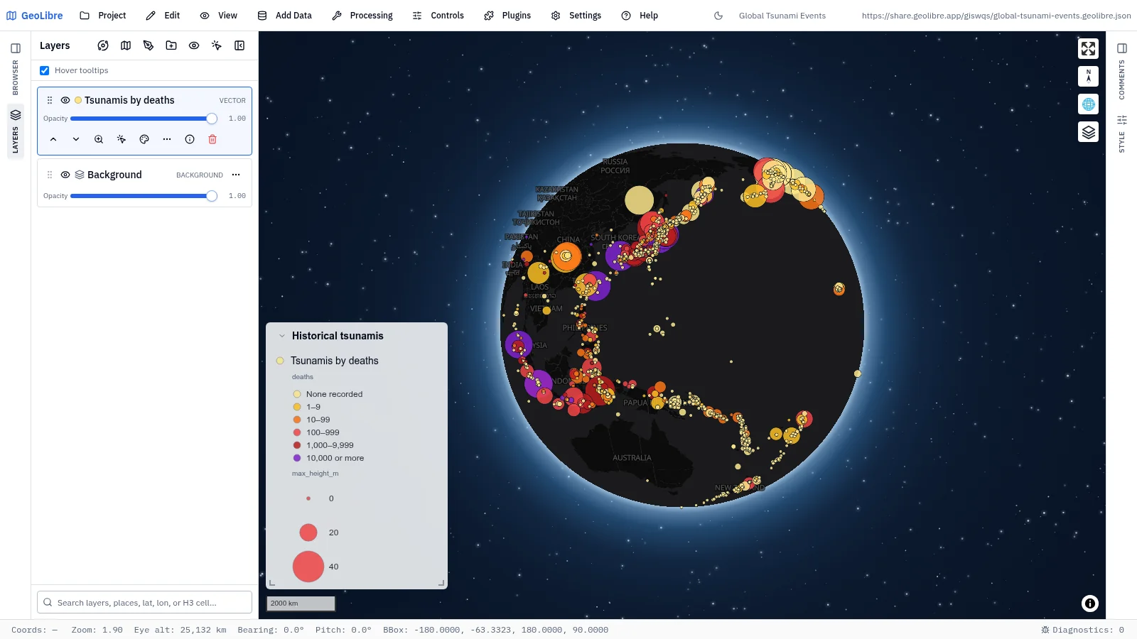
| Global tsunami events Natural hazards · 1,582 historical tsunamis sized by wave height and colored by deaths Data: NOAA NCEI |
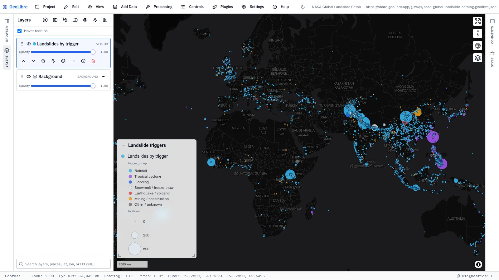
NASA Global Landslide Catalog Natural hazards · 11,033 landslides from 2007 to 2016, colored by trigger and sized by fatalities Data: NASA |
 |
 |
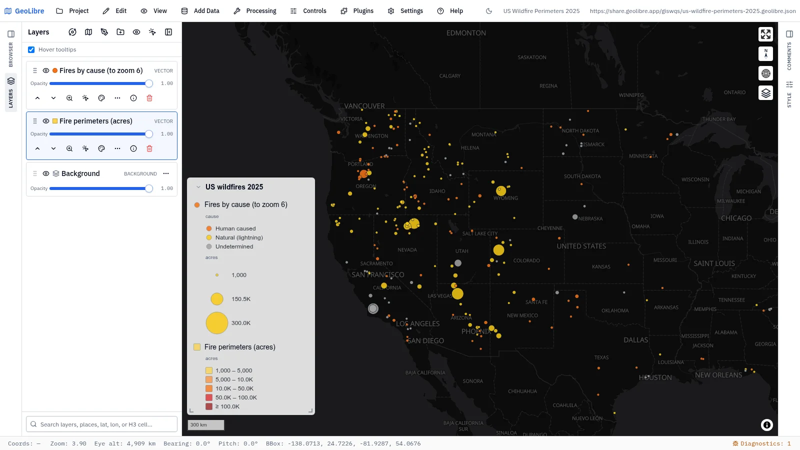
| US wildfire perimeters 2025 Wildfire · Fires of 1,000+ acres as circles by cause that become perimeters at zoom 6 Data: NIFC WFIGS |
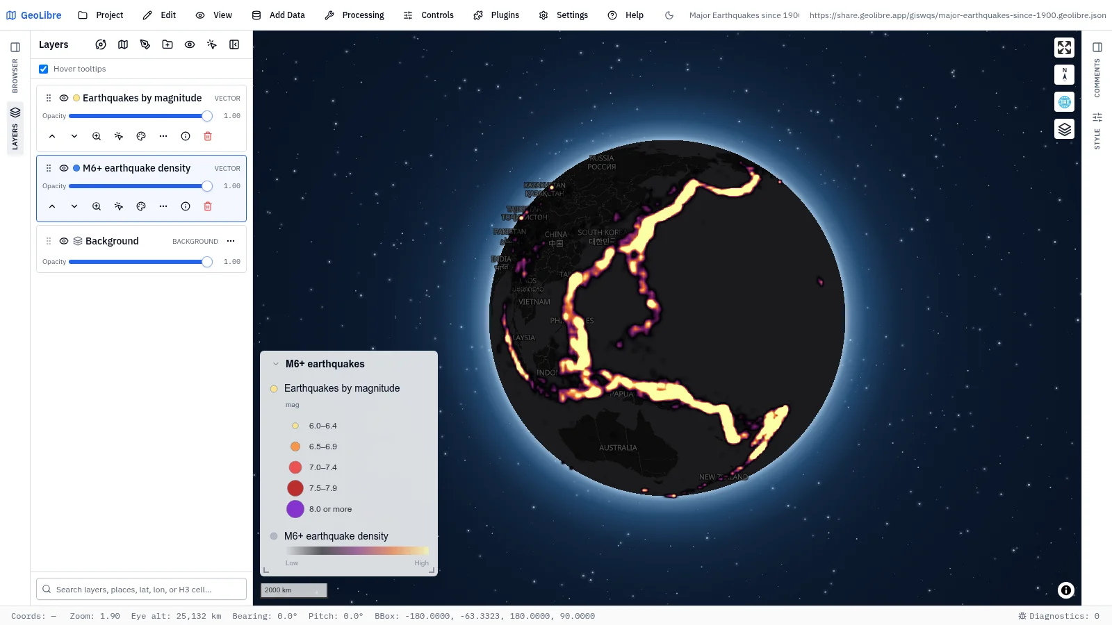
Major earthquakes since 1900 Natural hazards · Every M6+ quake since 1900 as a heatmap that resolves into points Data: USGS ComCat |
 |
|
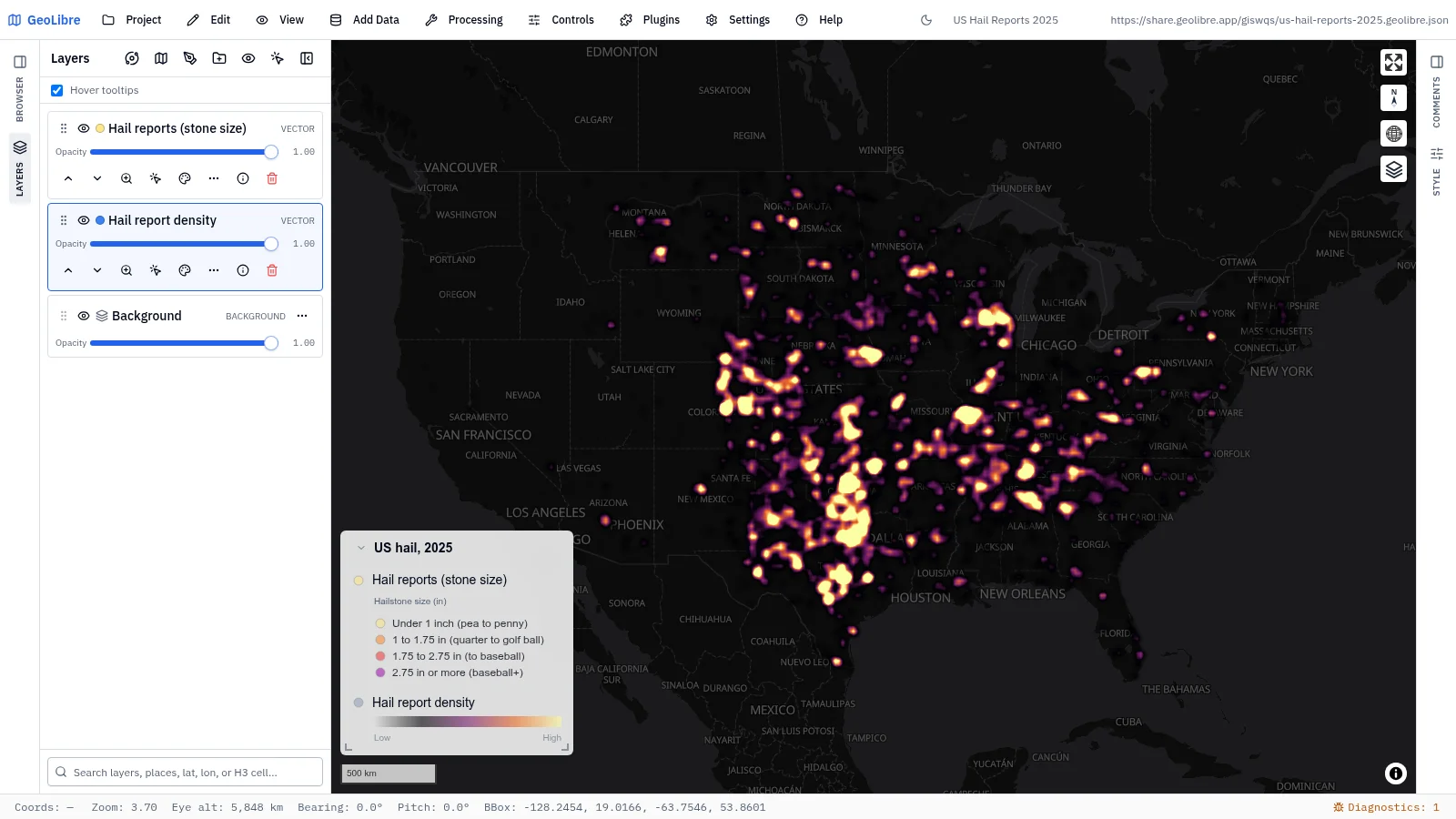
| US hail reports 2025 Weather · 9,205 hail reports weighted by hailstone size Data: NOAA NCEI Storm Events |
Climate
8 projects · Filter by the climate tag
 |
 |
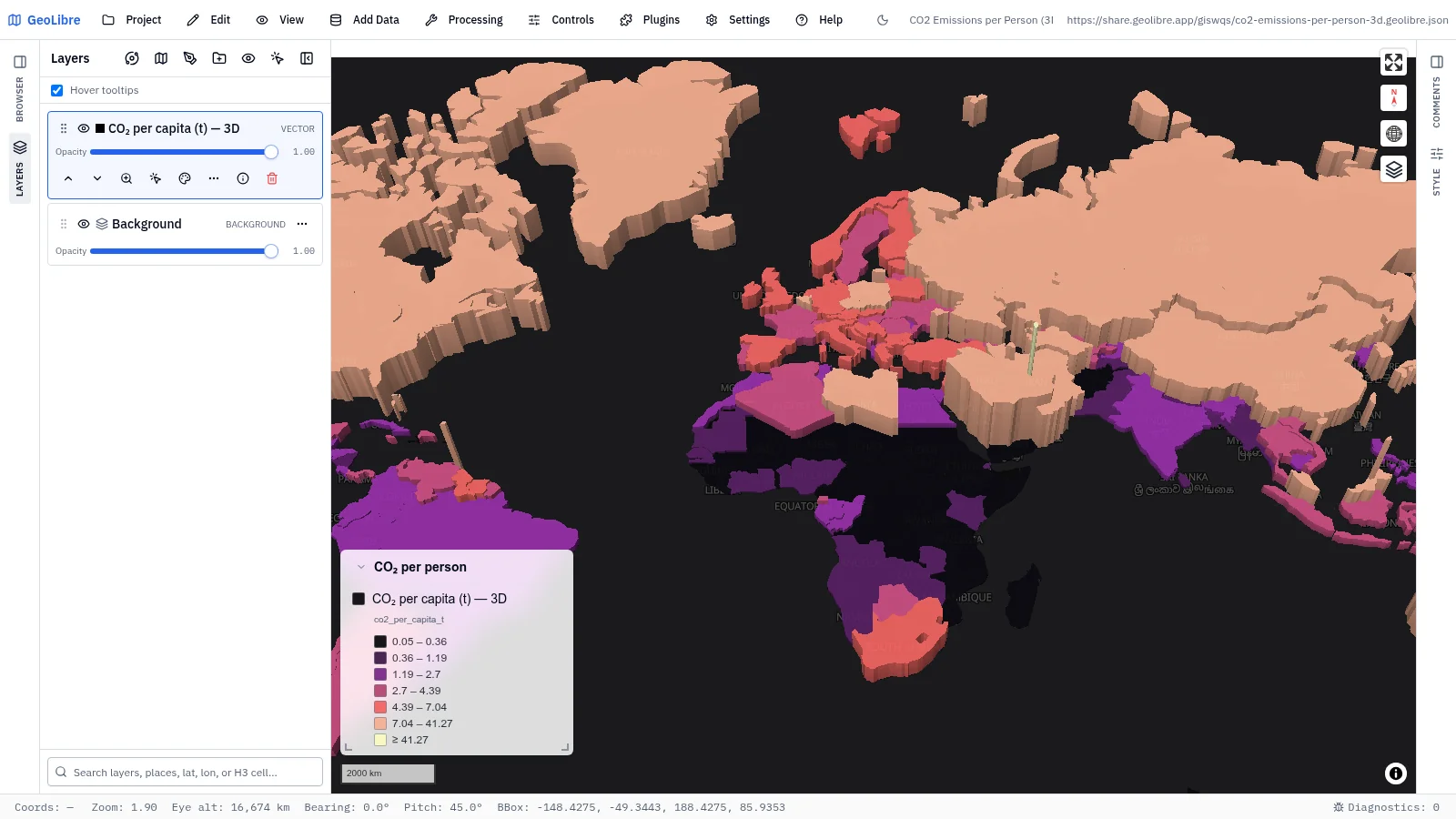
| CO₂ emissions per person Climate · Countries colored and extruded in 3D by per-capita emissions Data: Our World in Data |
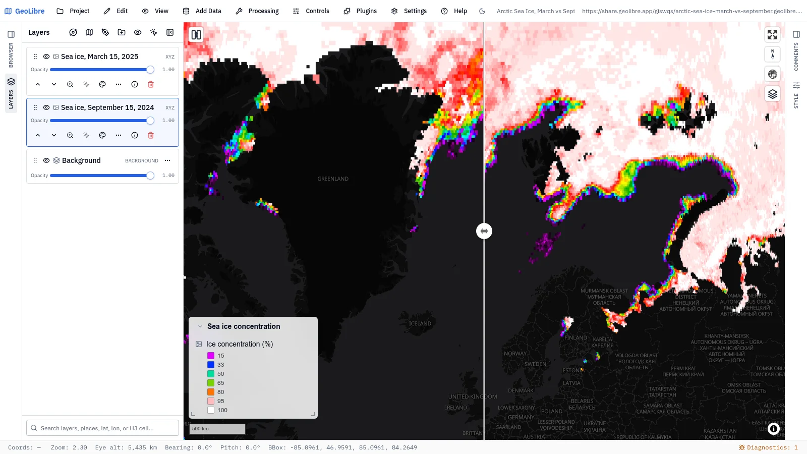
Arctic sea ice, March vs September Climate change · Swipe between the winter peak and the summer low of sea ice concentration Data: NASA GIBS (AMSR2) |
 |
 |
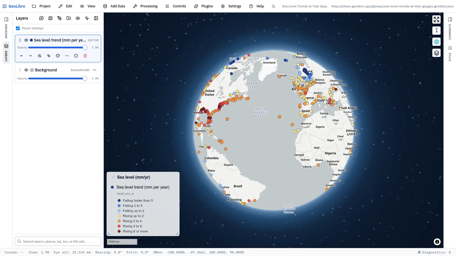
| Sea level trends at tide gauges Climate change · Sea level rising or falling at 509 tide gauges, in mm per year Data: NOAA CO-OPS |
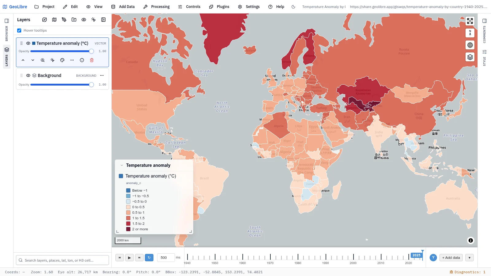
Temperature anomaly by country, 1940–2025 Climate change · Each country's yearly temperature anomaly on a time slider Data: Our World in Data, ERA5 |
 |
 |
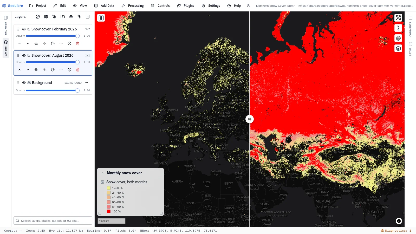
| Northern snow cover, summer vs winter Climate · Swipe between August and February snow cover across the Northern Hemisphere Data: NASA GIBS (MODIS) |
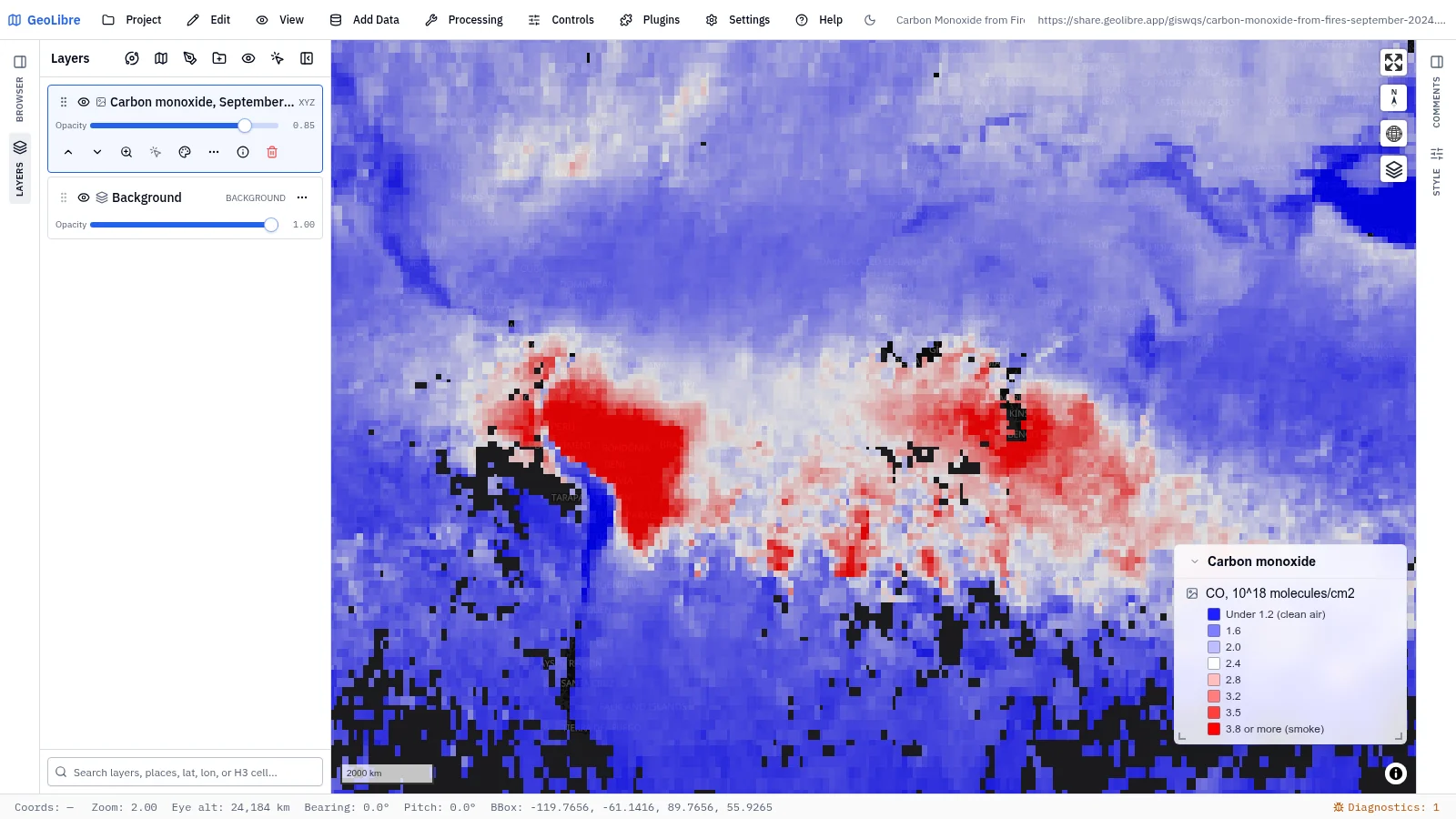
Carbon monoxide from fires Air quality · Smoke plumes from Amazon and African fires, September 2024 Data: NASA GIBS (Terra MOPITT) |
 |
 |
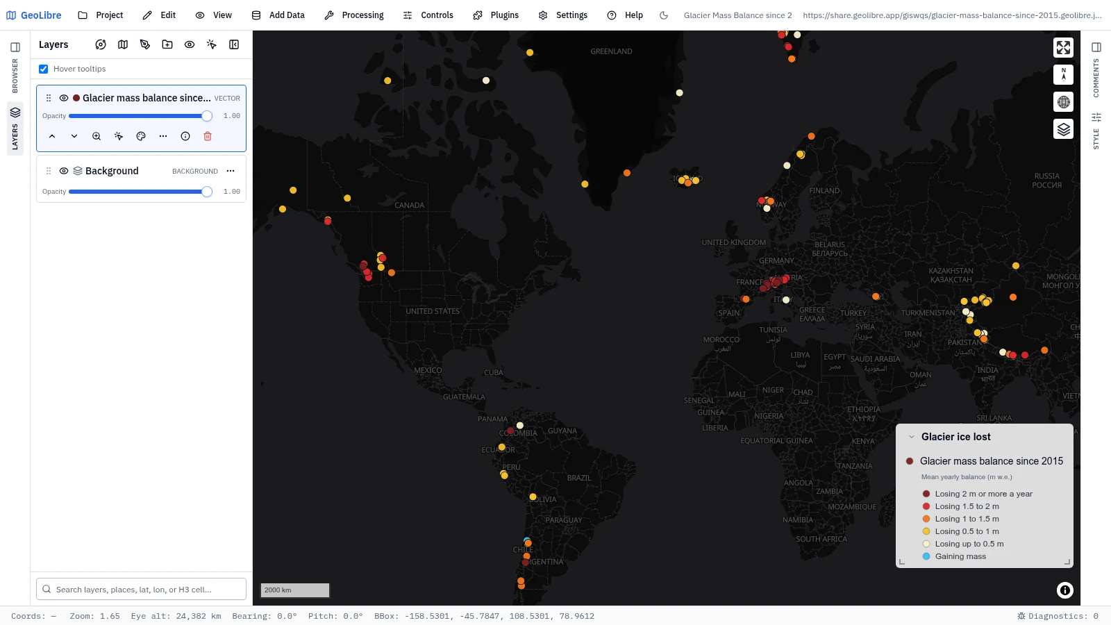
| Glacier mass balance since 2015 Climate change · 186 measured glaciers and their average yearly ice loss Data: WGMS |
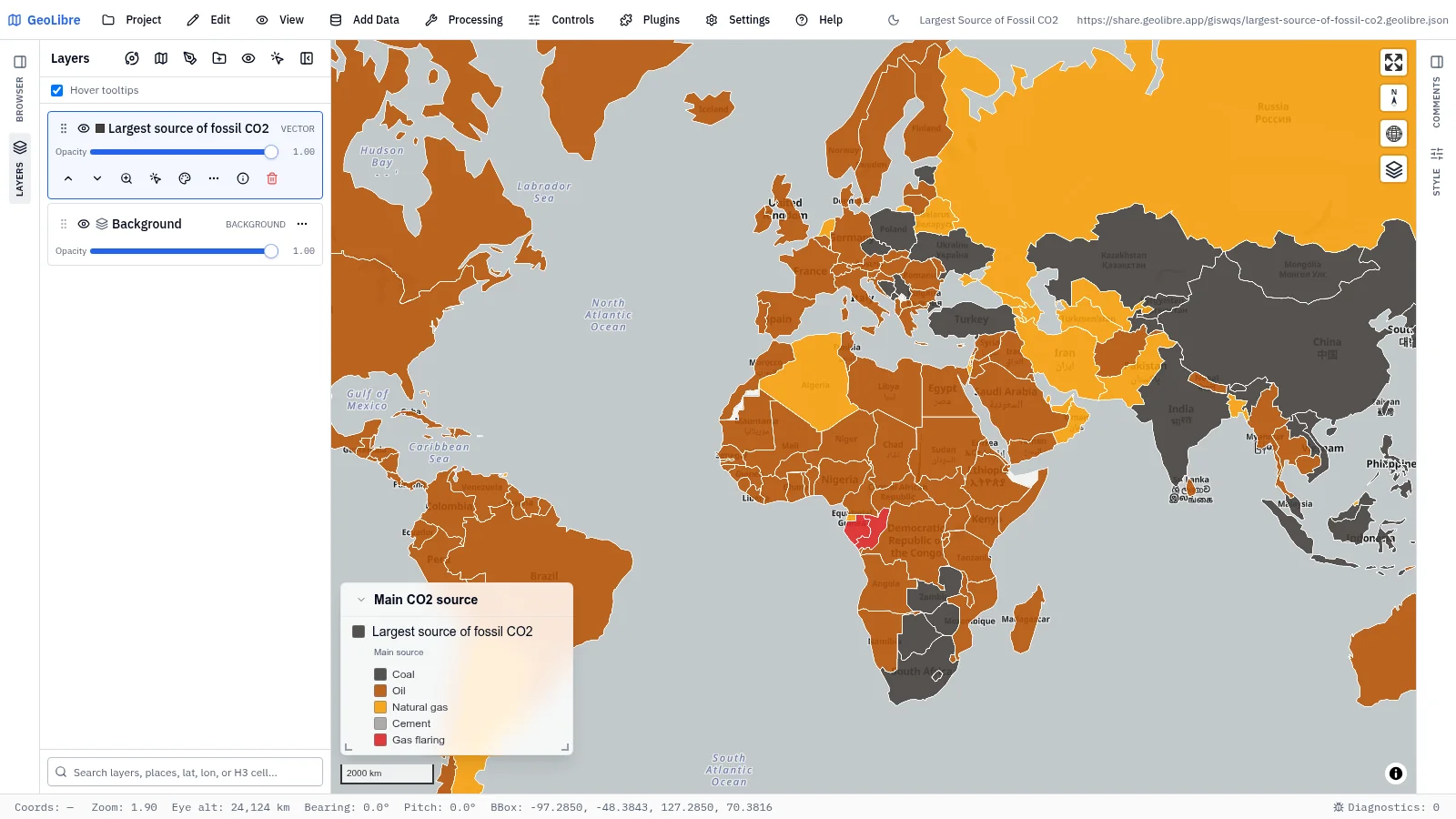
Largest source of fossil CO2 Climate · The fuel behind most of each country's fossil CO2 emissions Data: Global Carbon Budget via Our World in Data |
Oceans and water
9 projects · Filter by the oceans-water tag
 |
 |
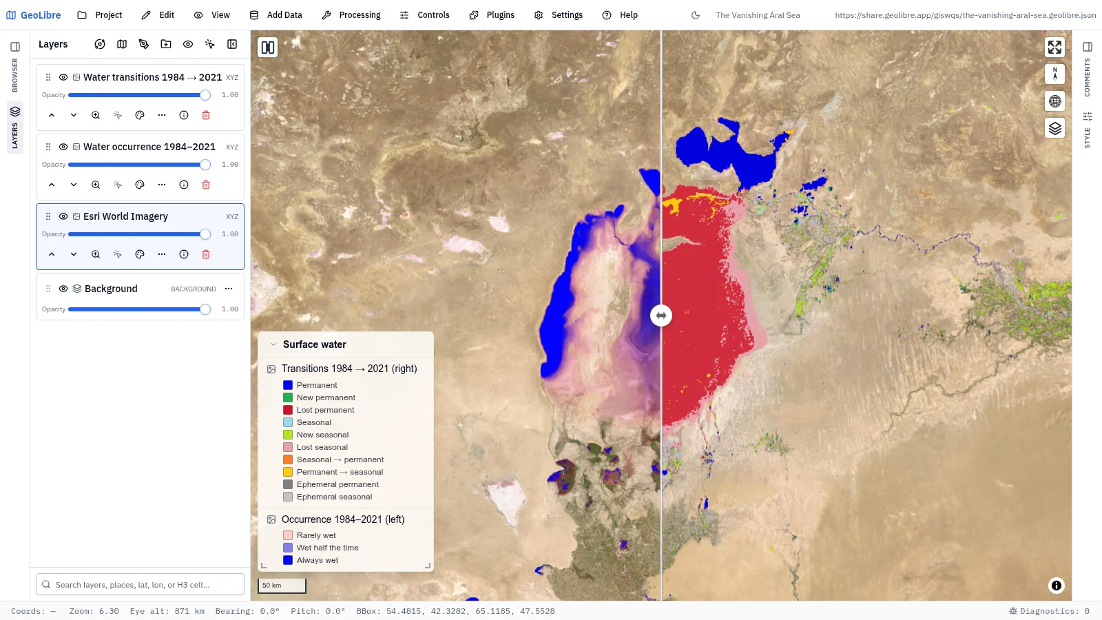
| The vanishing Aral Sea Environmental change · Swipe between water occurrence and 1984–2021 transitions Data: EC JRC Global Surface Water |
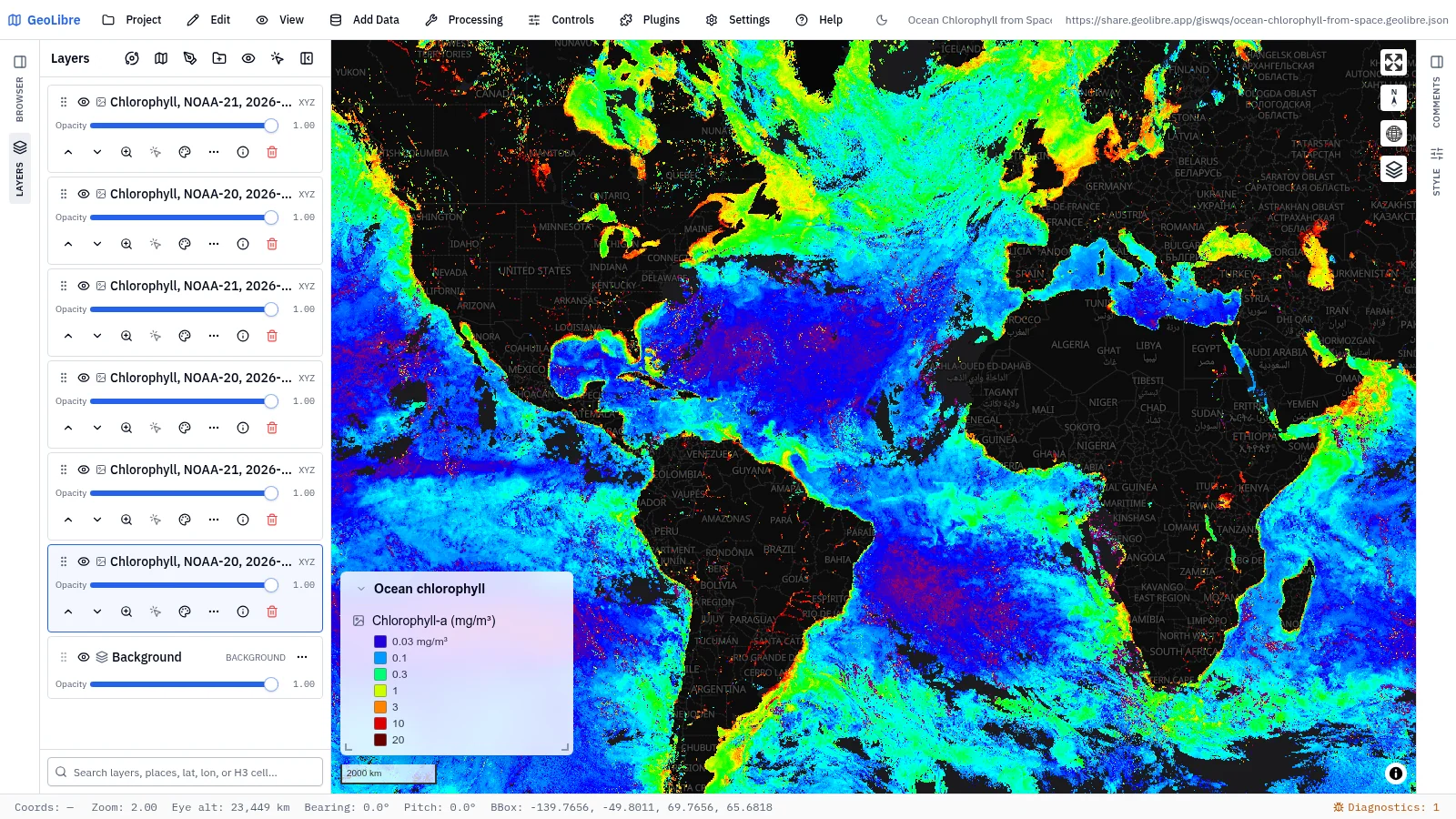
Ocean chlorophyll from space Oceans · Phytoplankton from a three-day NOAA-20/21 chlorophyll composite Data: NASA GIBS (VIIRS) |
 |
 |
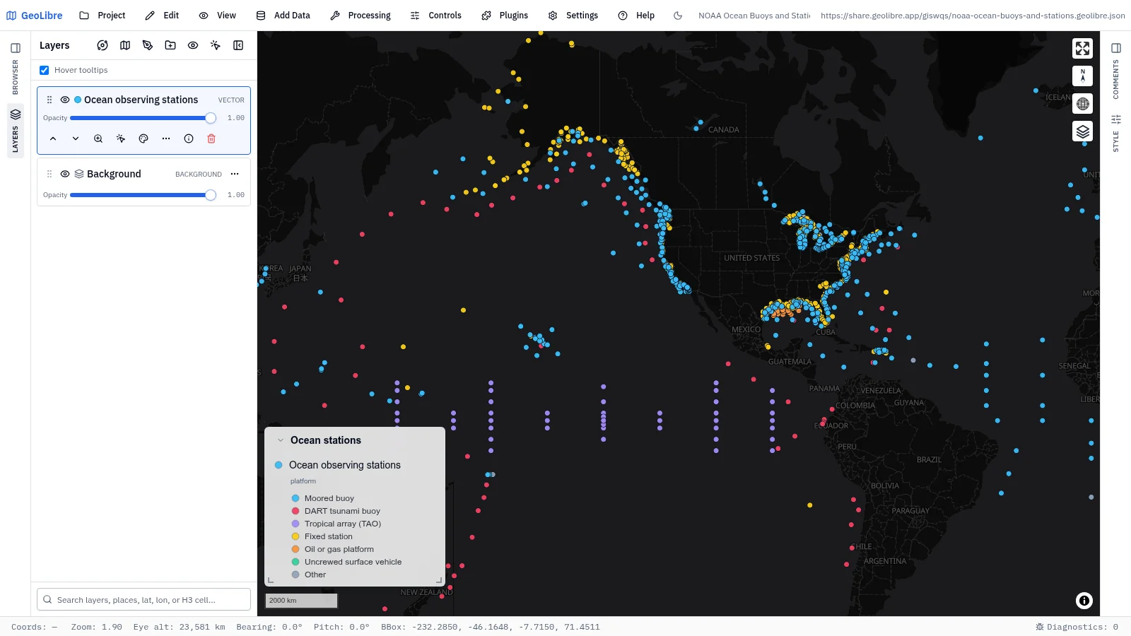
| NOAA ocean buoys and stations Oceans · 1,354 active buoys and stations by platform type Data: NOAA NDBC |
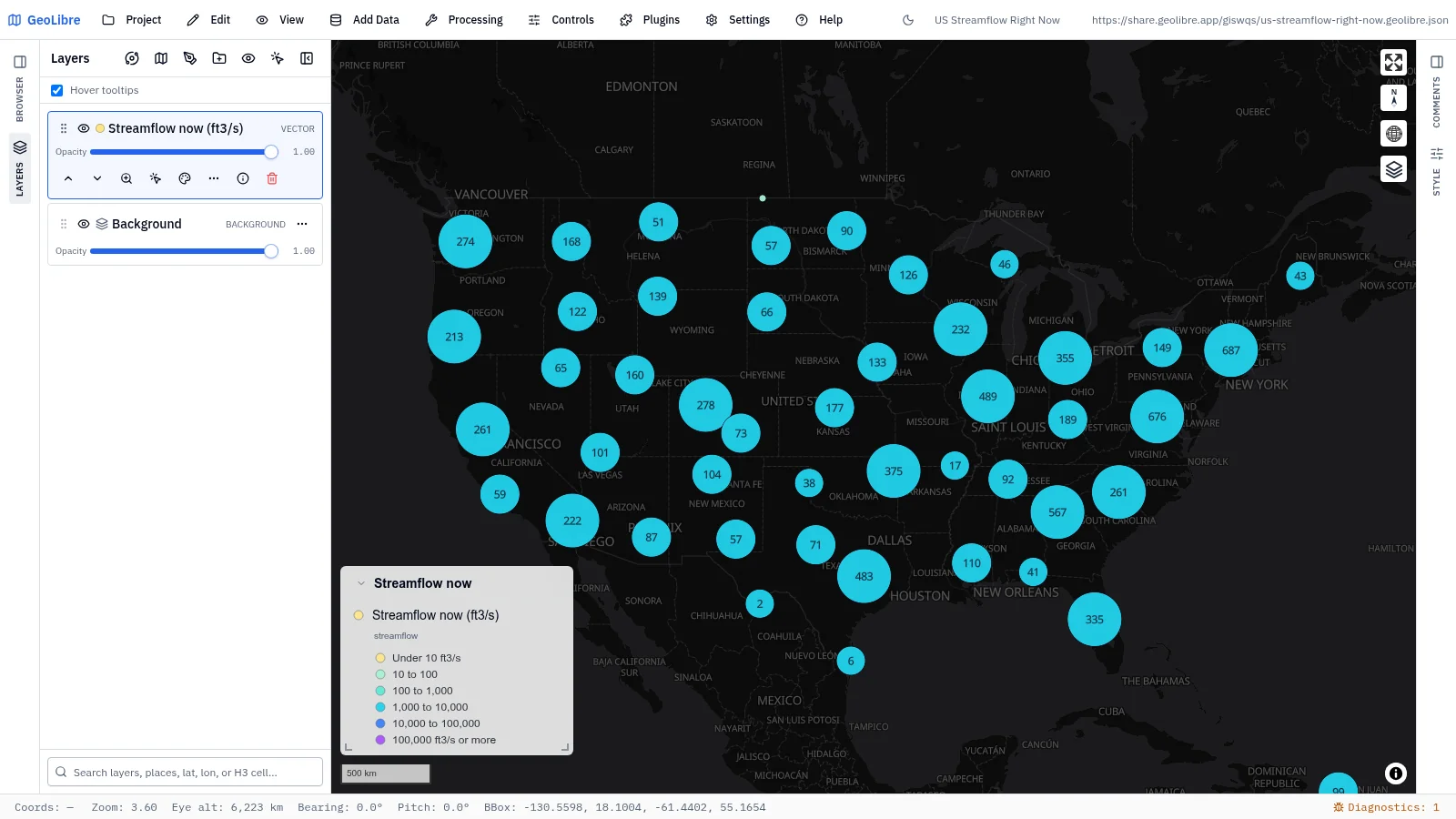
US streamflow right now Water · Latest discharge at about 8,600 USGS streamgages, clustered Data: USGS Water Data |
 |
 |
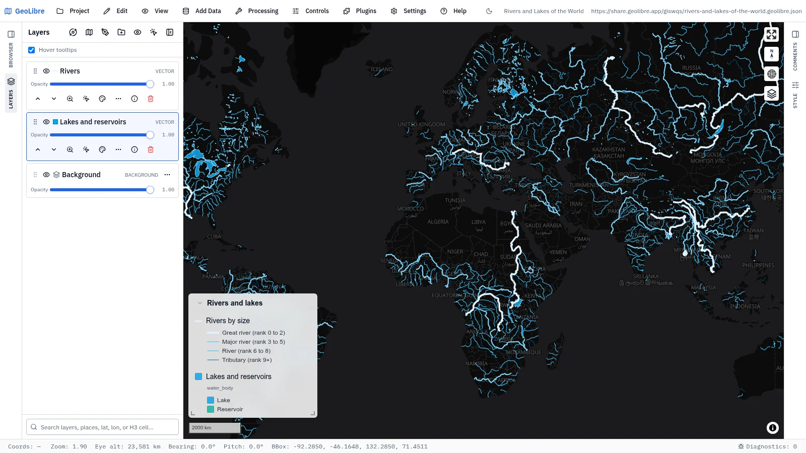
| Rivers and lakes of the world Water · Rivers sized by rank, with lakes and reservoirs, labeled as you zoom Data: Natural Earth |
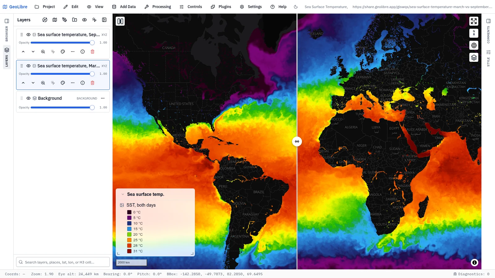
Sea surface temperature, March vs September Oceans · Swipe between ocean temperatures in March and September Data: NASA GIBS (GHRSST MUR) |
 |
 |
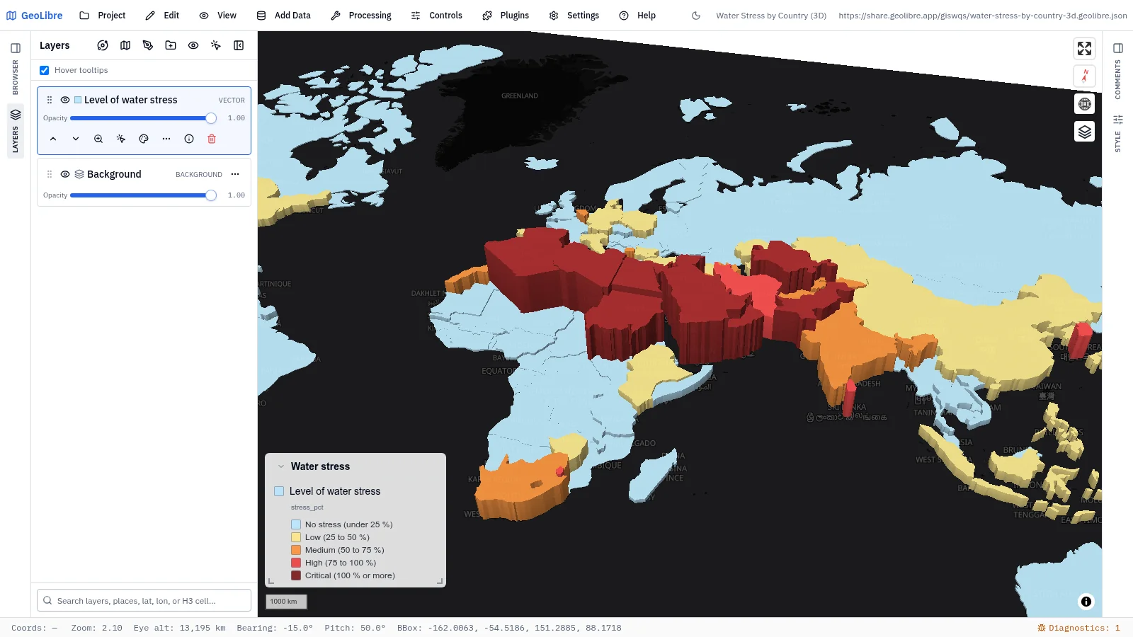
| Water stress by country in 3D Water · Freshwater withdrawals as a share of renewable supply, in 3D Data: World Bank (FAO AQUASTAT) |
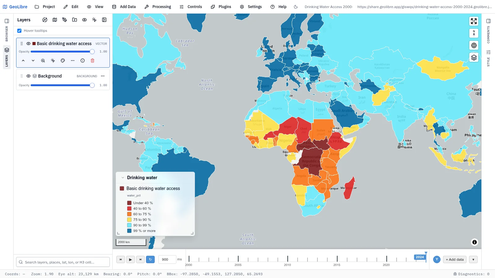
Drinking water access, 2000–2024 Water · Share of people with basic drinking water on a time slider Data: World Bank (WHO/UNICEF JMP) |
 |
|
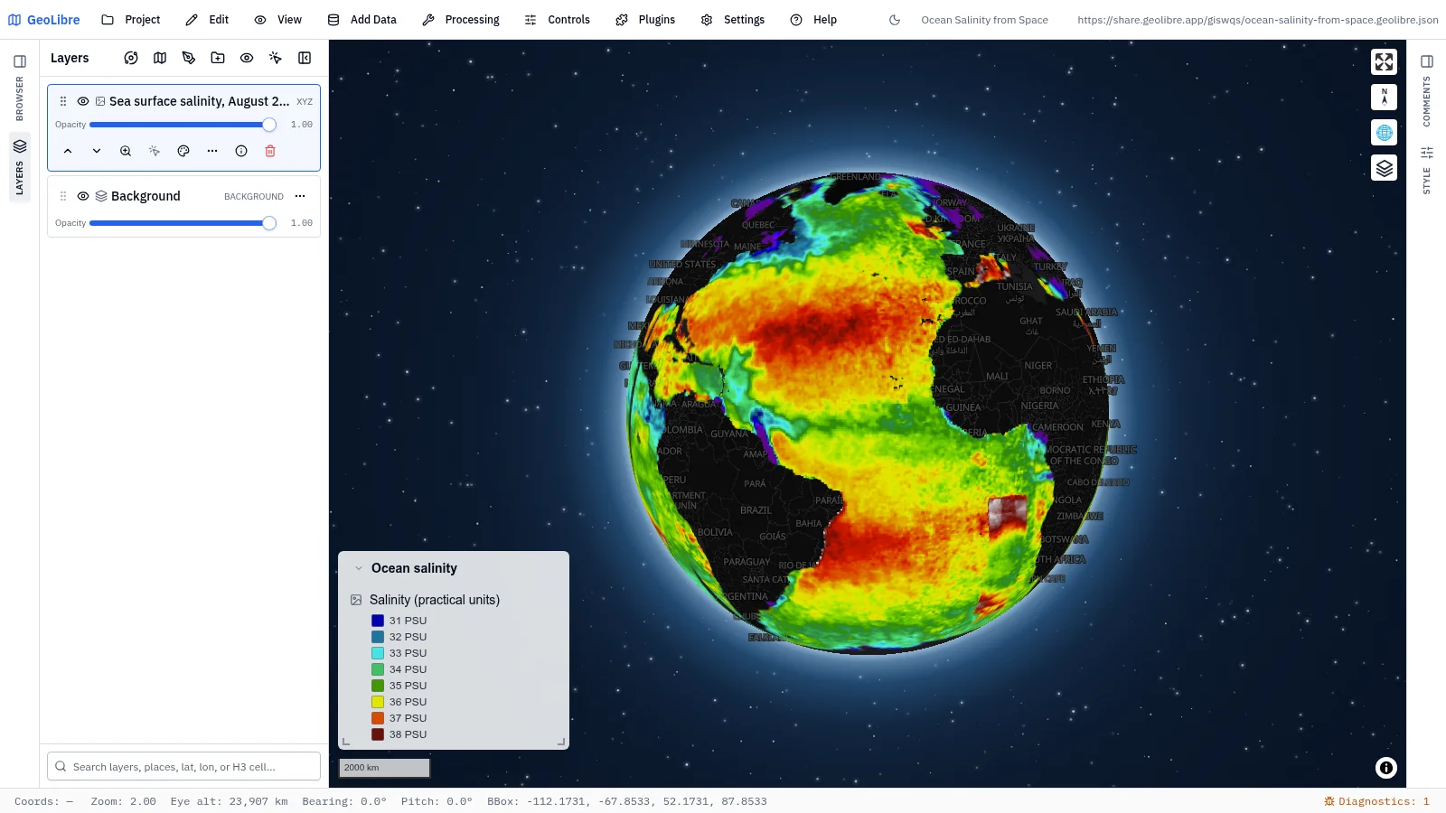
| Ocean salinity from space Oceans · Sea surface salinity measured from orbit, on the globe Data: NASA GIBS (SMAP) |
Nature and land
7 projects · Filter by the nature-land tag
 |
 |
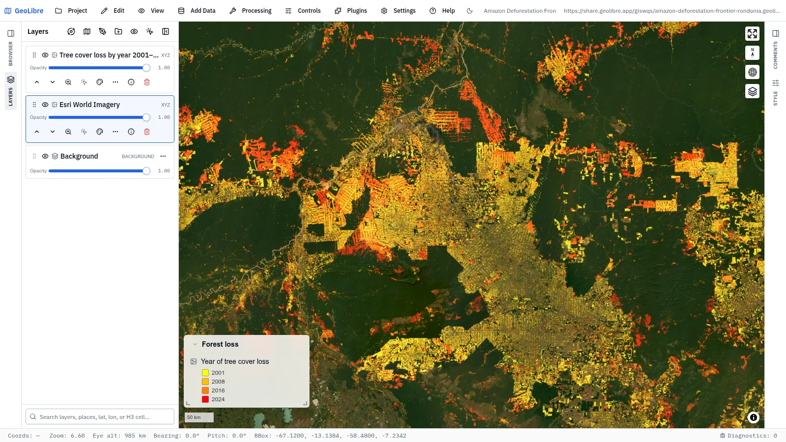
| Amazon deforestation frontier Environmental change · Tree-cover loss by year, 2001–2024, over Rondônia Data: Hansen / UMD Global Forest Change |
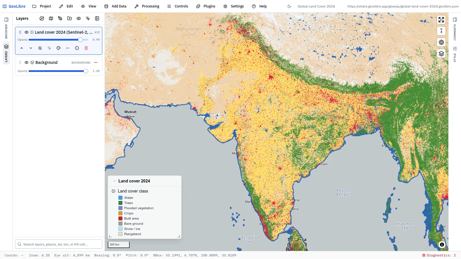
Global land cover 2024 Land use · 10 m land use / land cover streamed from an ArcGIS ImageServer Data: Esri, Impact Observatory |
 |
 |
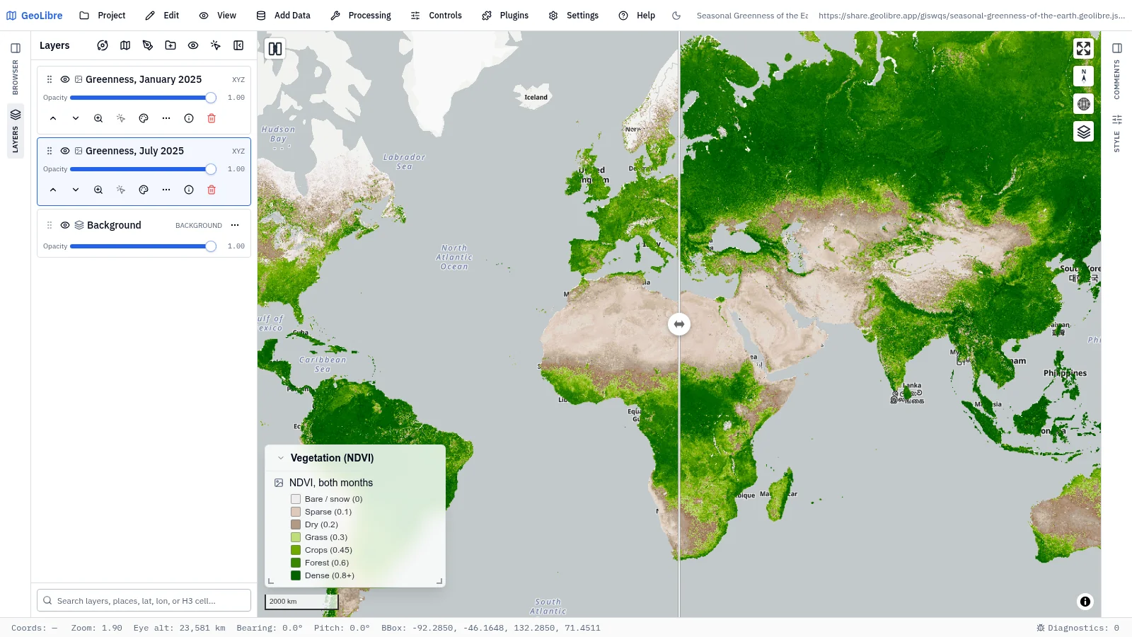
| Seasonal greenness of the Earth Ecology · Swipe between January and July vegetation index Data: NASA GIBS (MODIS NDVI) |
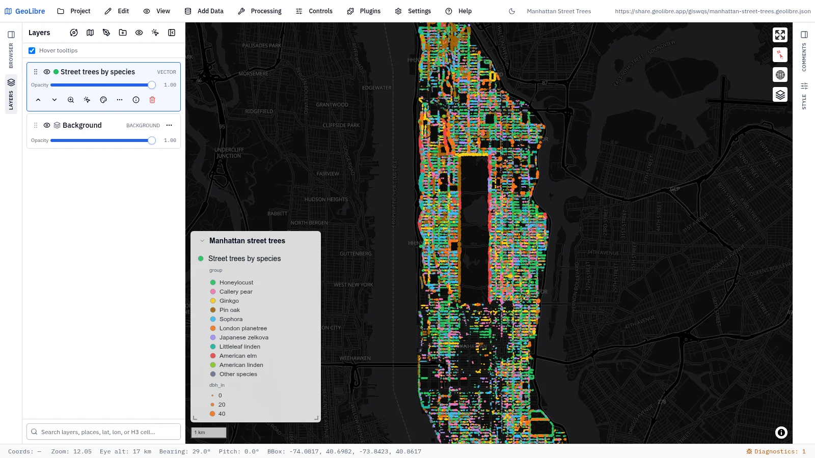
Manhattan street trees Cities · 62,427 street trees by species and trunk size, aligned to the street grid Data: NYC Street Tree Census |
 |
 |
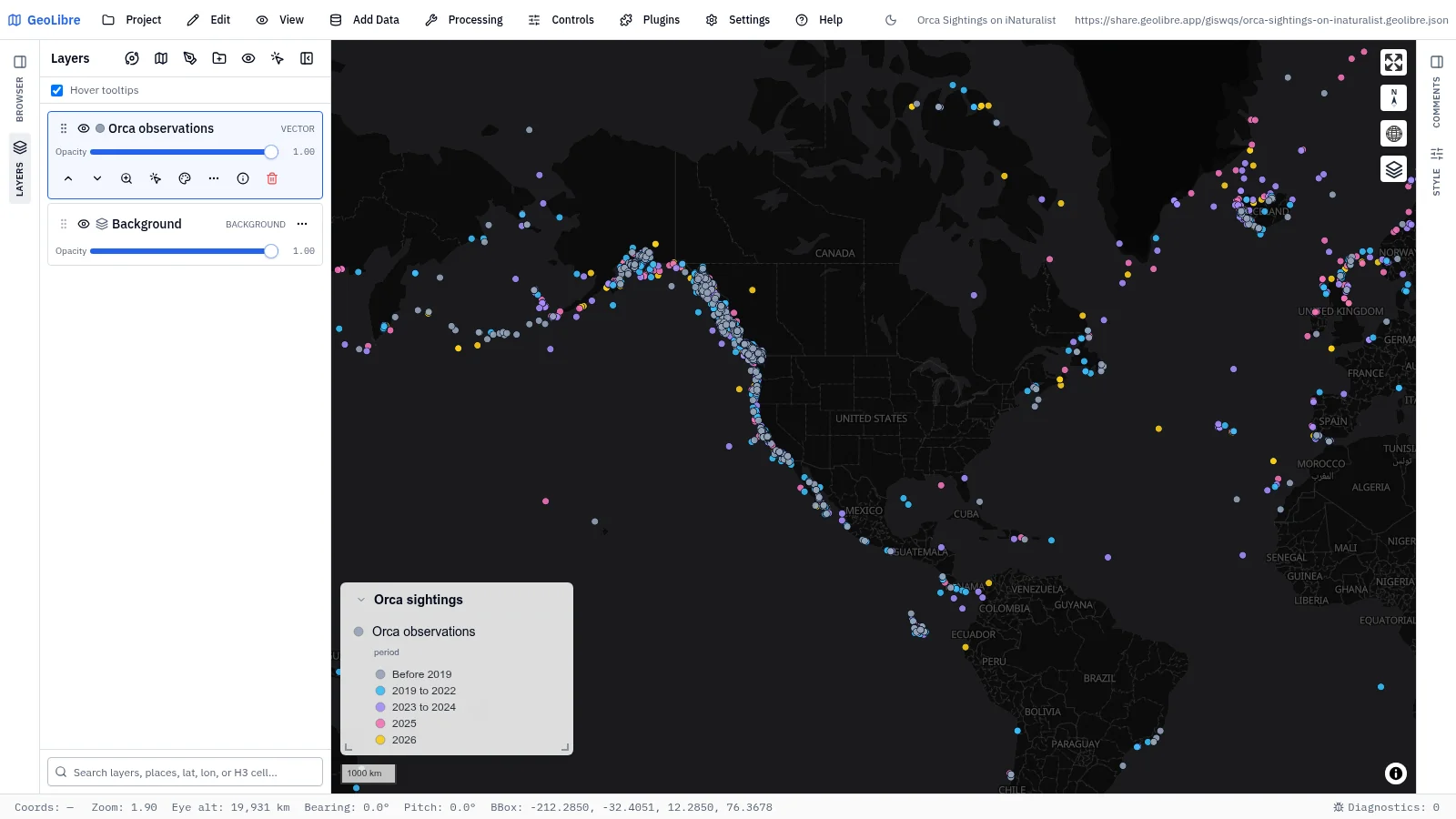
| Orca sightings on iNaturalist Biodiversity · 8,527 research-grade orca sightings; click any dot for its photo Data: iNaturalist |
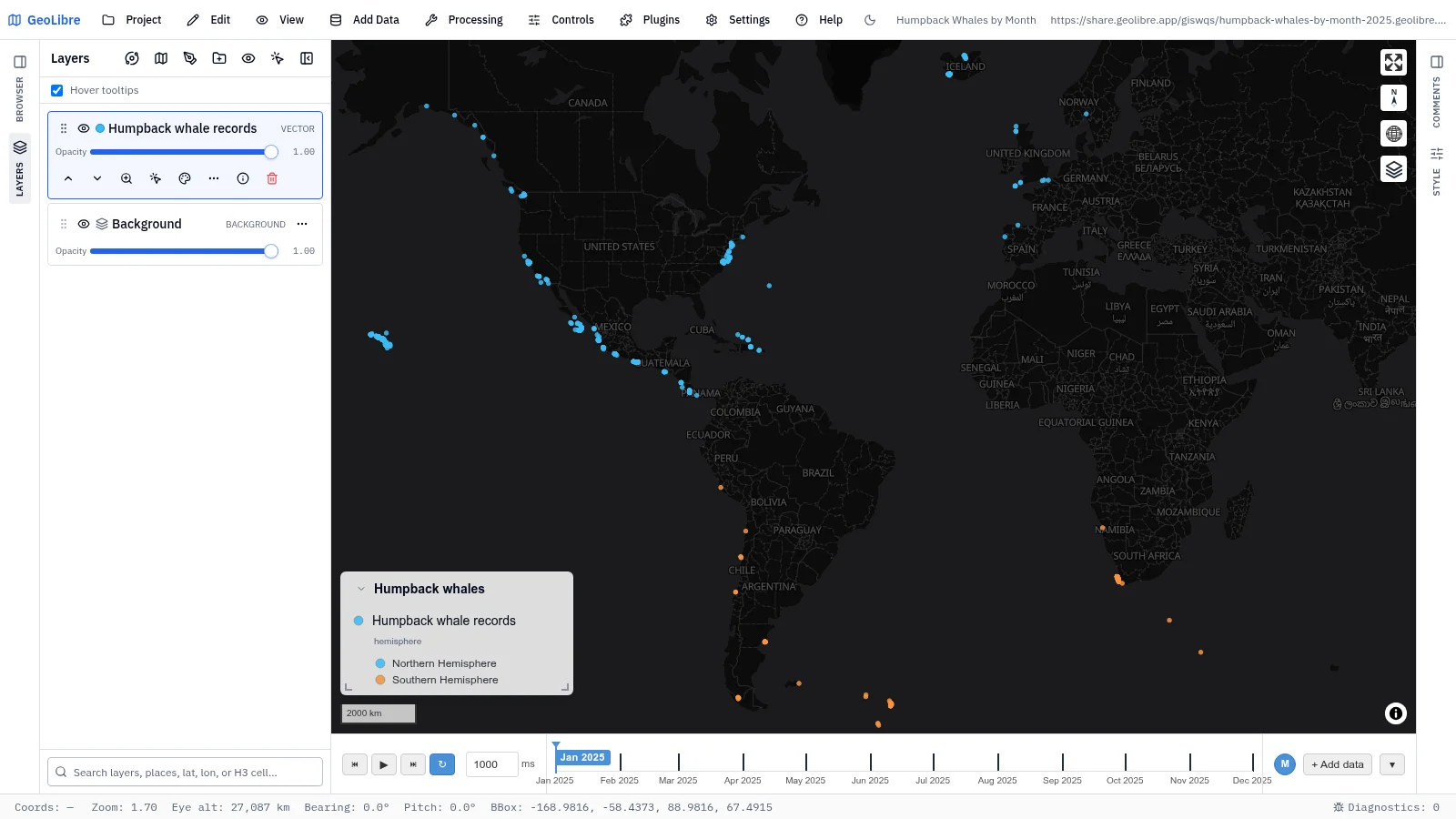
Humpback whales by month Biodiversity · Humpback records month by month, from feeding grounds to breeding grounds Data: GBIF.org |
 |
|
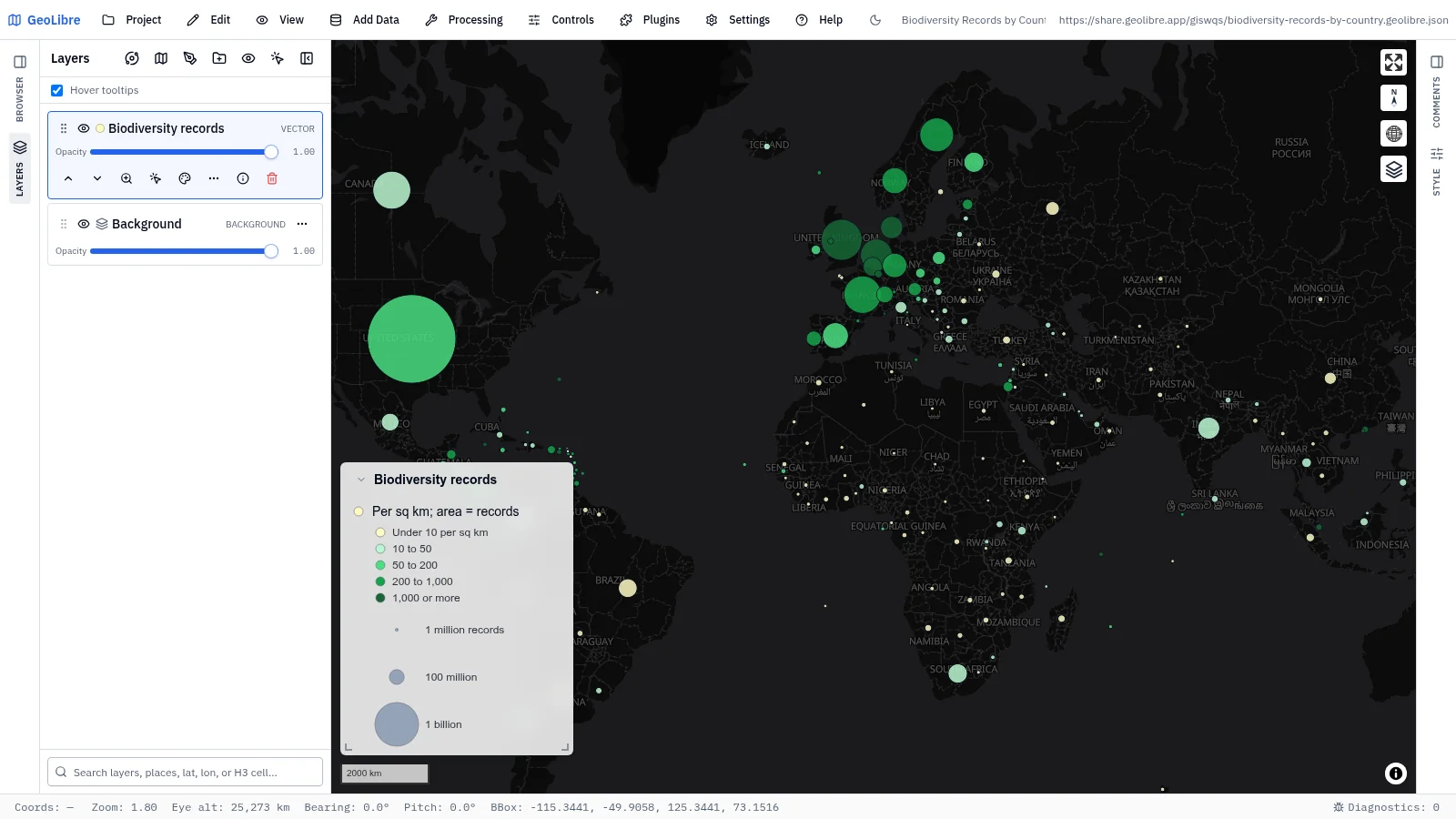
| Biodiversity records by country Biodiversity · Four billion records: circle area is records, color is records per km² Data: GBIF, World Bank |
Transport and mobility
11 projects · Filter by the transport tag
 |
 |
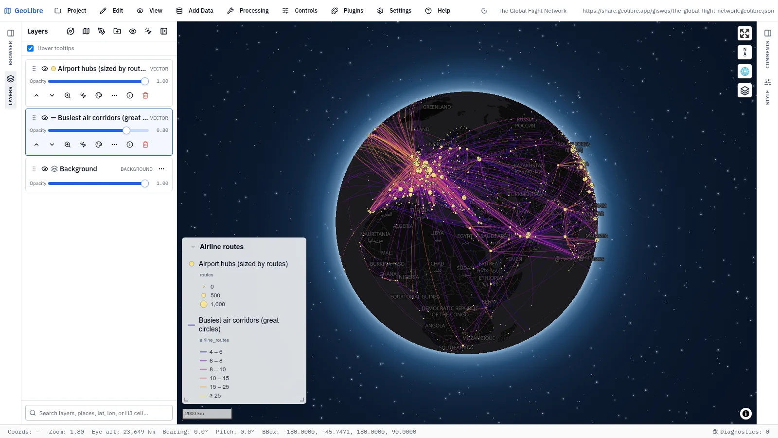
| The global flight network Human mobility · The 4,000 busiest air corridors as great circles, hubs sized by routes Data: OpenFlights |
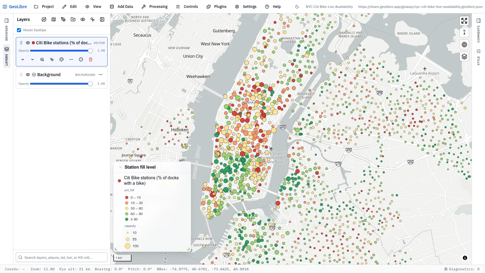
NYC Citi Bike availability Human mobility · Every station colored by fill level and sized by capacity Data: Citi Bike GBFS feed |
 |
 |
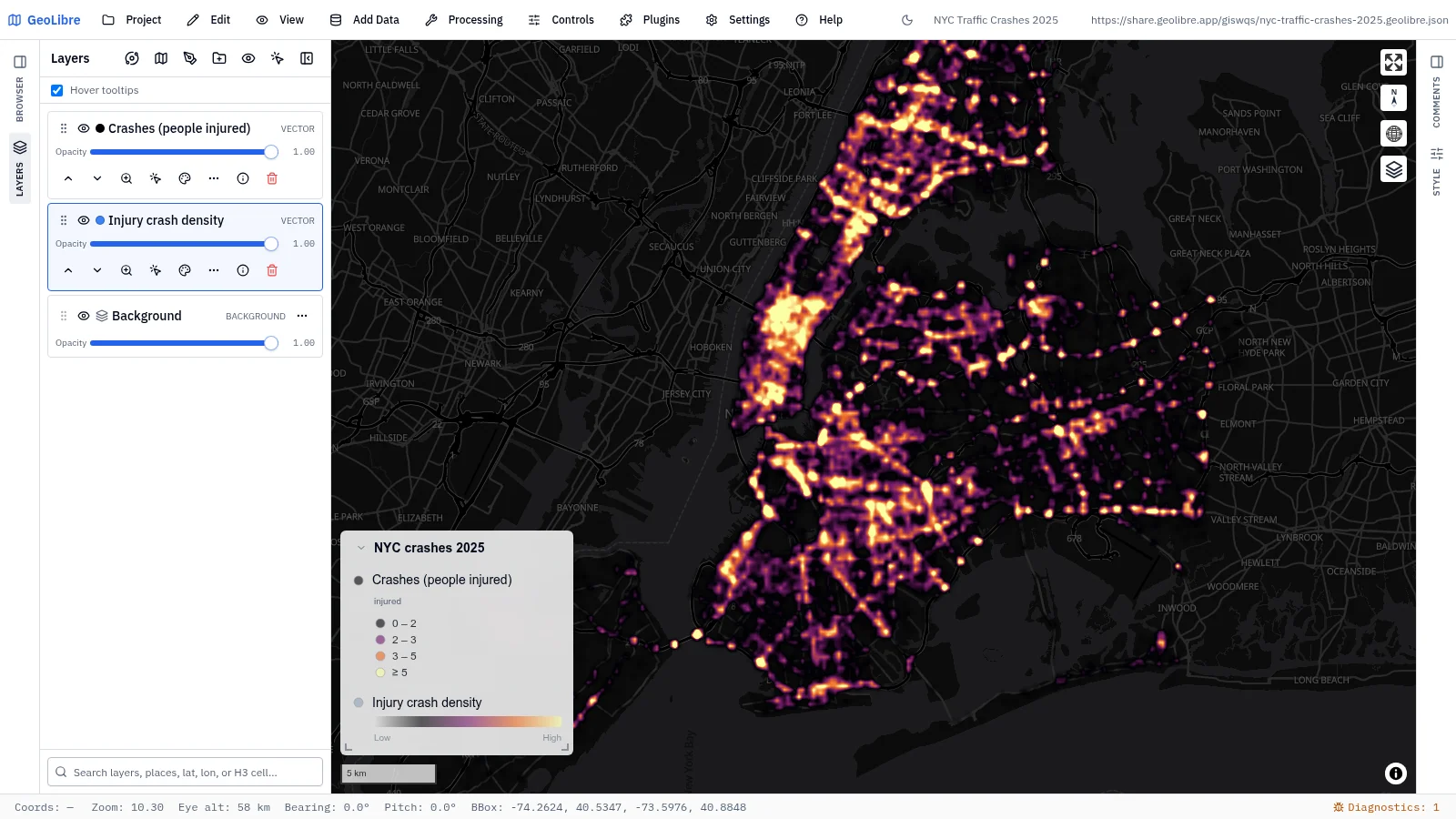
| NYC traffic crashes 2025 Road safety · Severity-weighted heatmap of injury crashes that resolves into points Data: NYC Open Data |
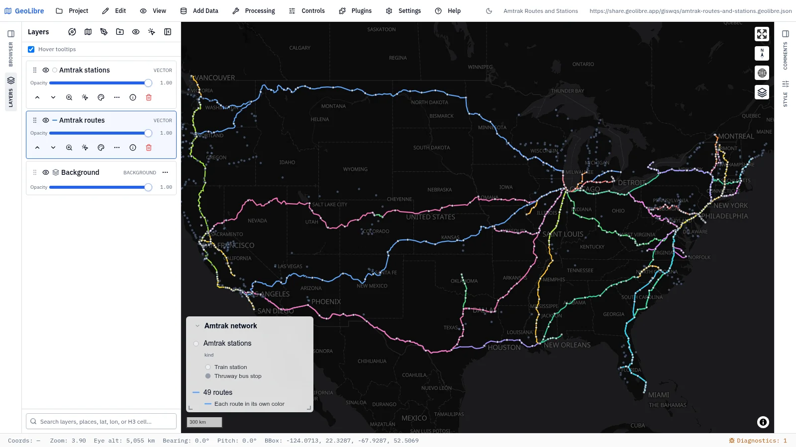
Amtrak routes and stations Mobility · 49 Amtrak routes in their own colors, with stations and Thruway stops Data: US DOT BTS NTAD |
 |
 |
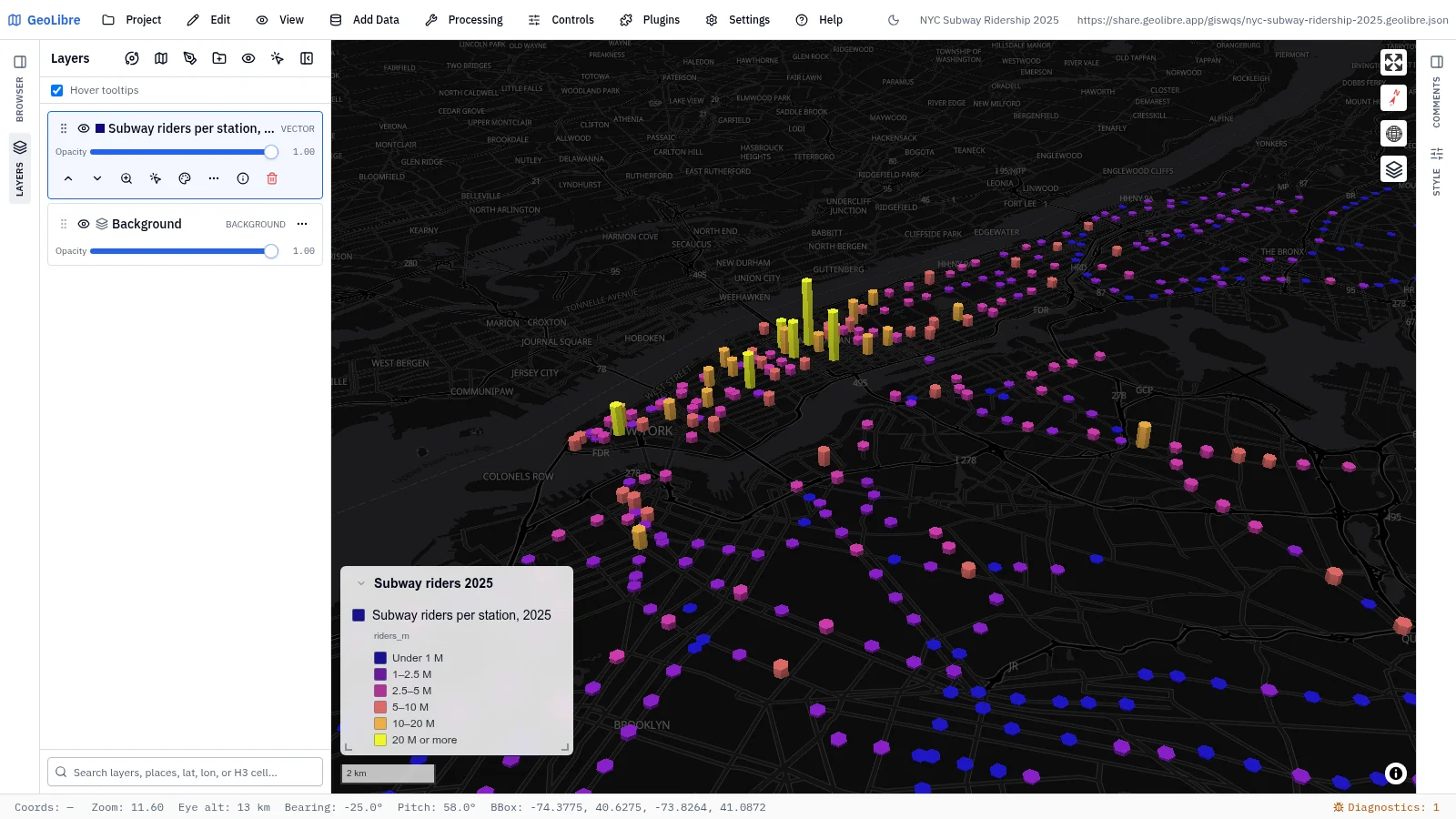
| NYC subway ridership 2025 Mobility · 2025 entries at 426 subway stations as 3D columns Data: MTA via data.ny.gov |
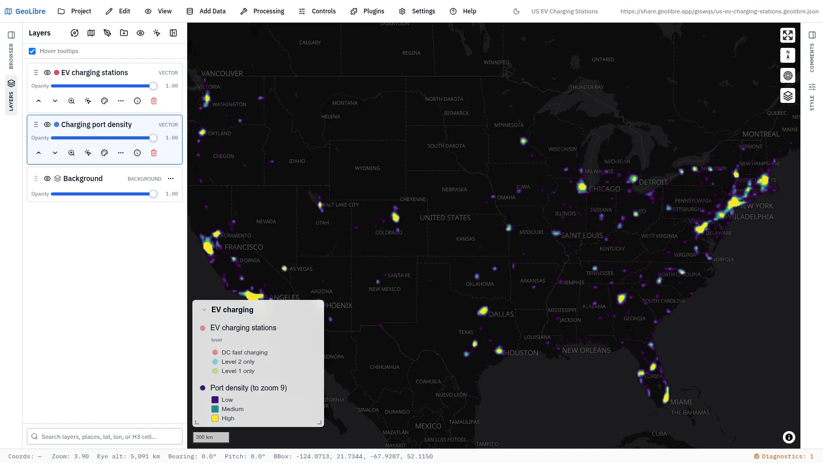
US EV charging stations Mobility · 87,644 EV chargers as a heatmap that resolves into stations by level Data: DOE AFDC |
 |
 |
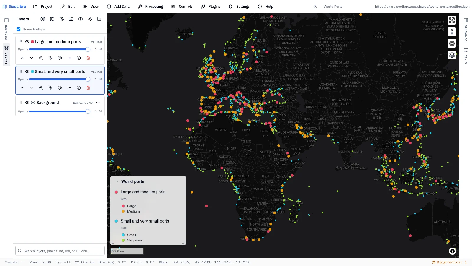
| World ports Mobility · 2,945 world ports colored by harbor size Data: NGA World Port Index |
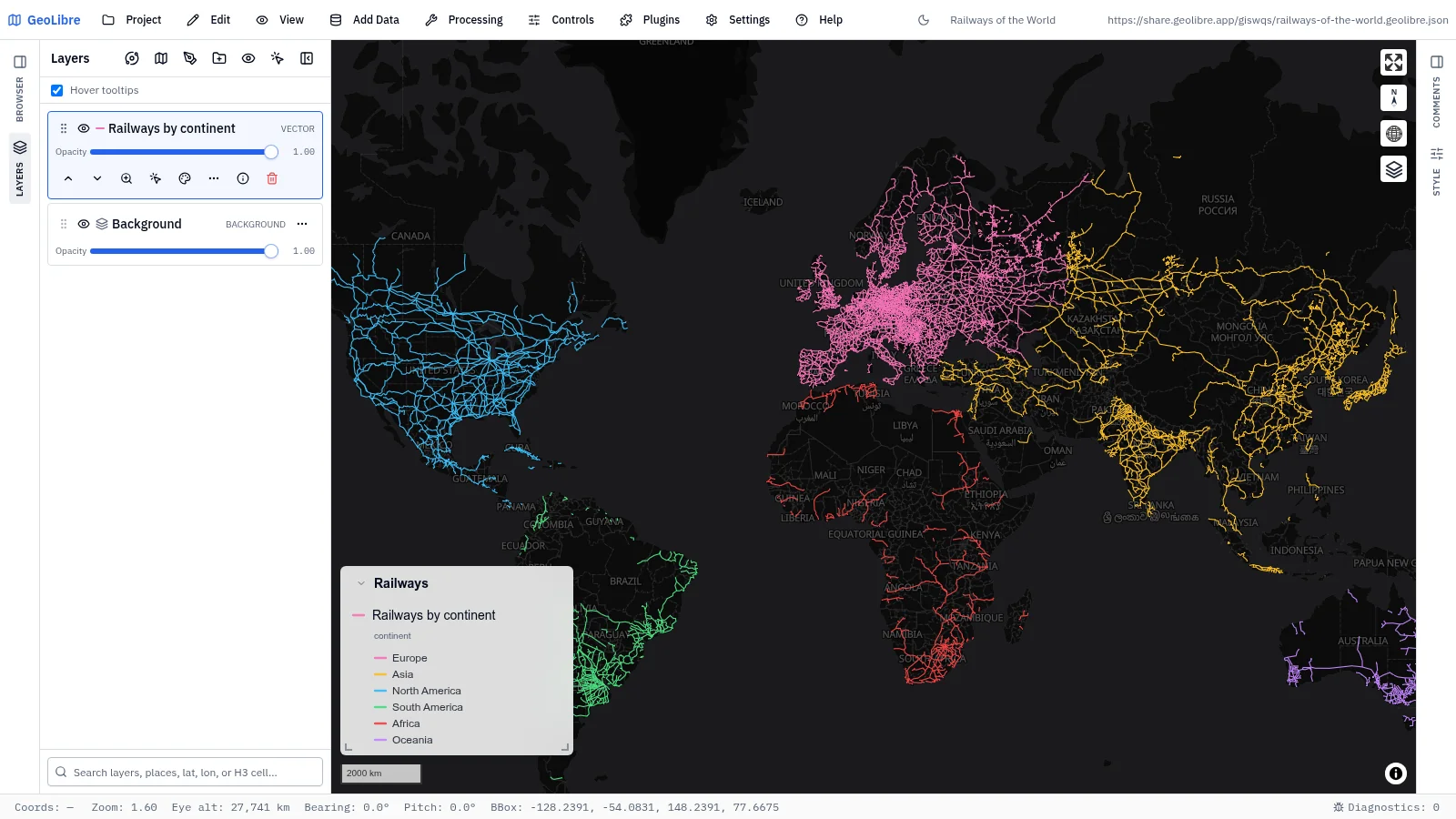
Railways of the world Transport · About 925,000 km of railways, colored by continent Data: Natural Earth |
 |
 |
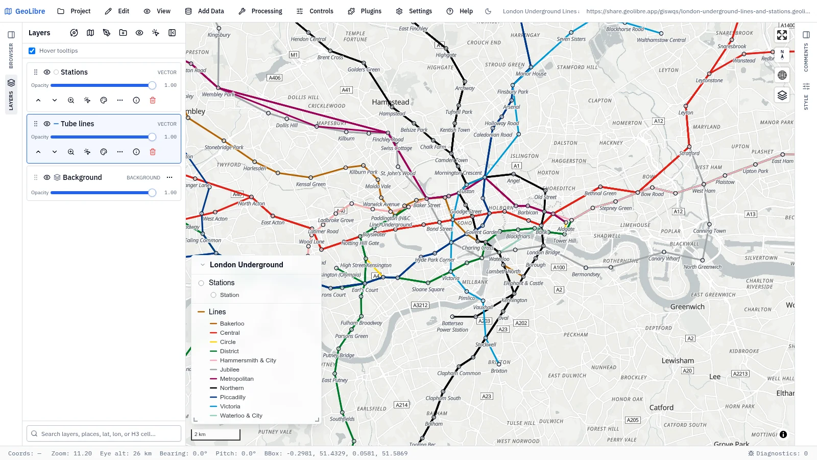
| London Underground lines and stations Transport · 11 tube lines in their official colors and 272 stations with fare zones Data: TfL Unified API |
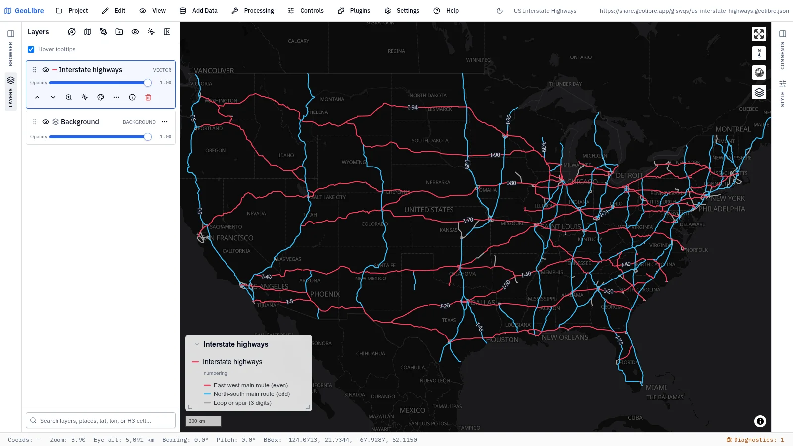
US Interstate highways Transport · Interstates labeled along the line, colored by the numbering rule Data: Natural Earth |
 |
|
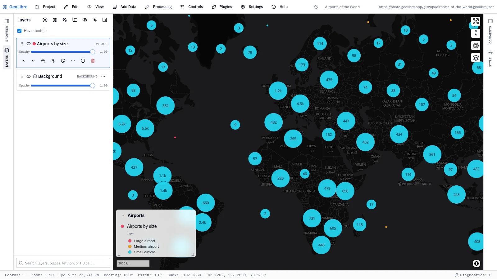
| Airports of the world Transport · 48,027 airports and airfields in clusters, colored by size Data: OurAirports |
Cities and infrastructure
8 projects · Filter by the cities-infrastructure tag
 |
 |
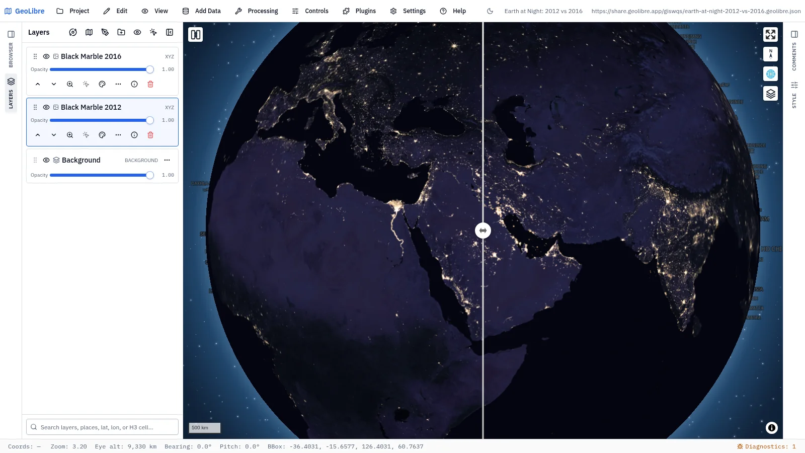
| Earth at night, 2012 vs 2016 Human footprint · Swipe between two years of night lights Data: NASA Black Marble |
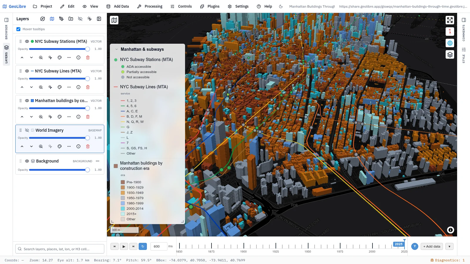
Manhattan buildings through time Urban growth · Buildings extruded at true height and replayed by construction year, 1850–2025, under the subway Data: NYC Open Data, MTA |
 |
 |
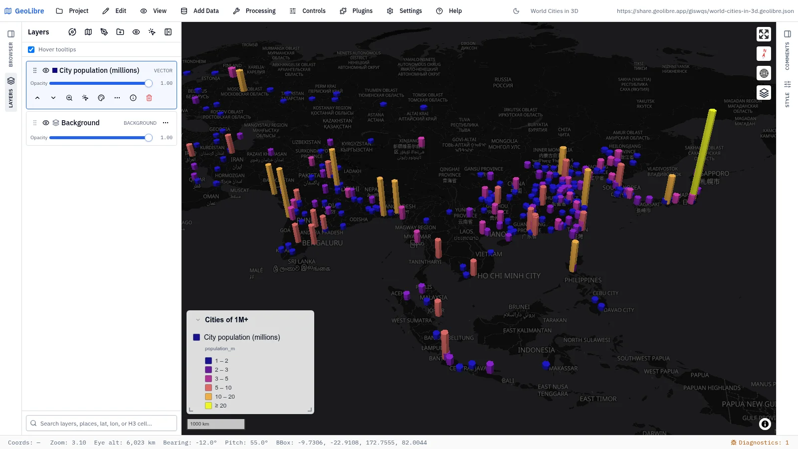
| World cities in 3D Human footprint · Every metro of 1M+ people raised as a 3D spike in proportion to population Data: Natural Earth |
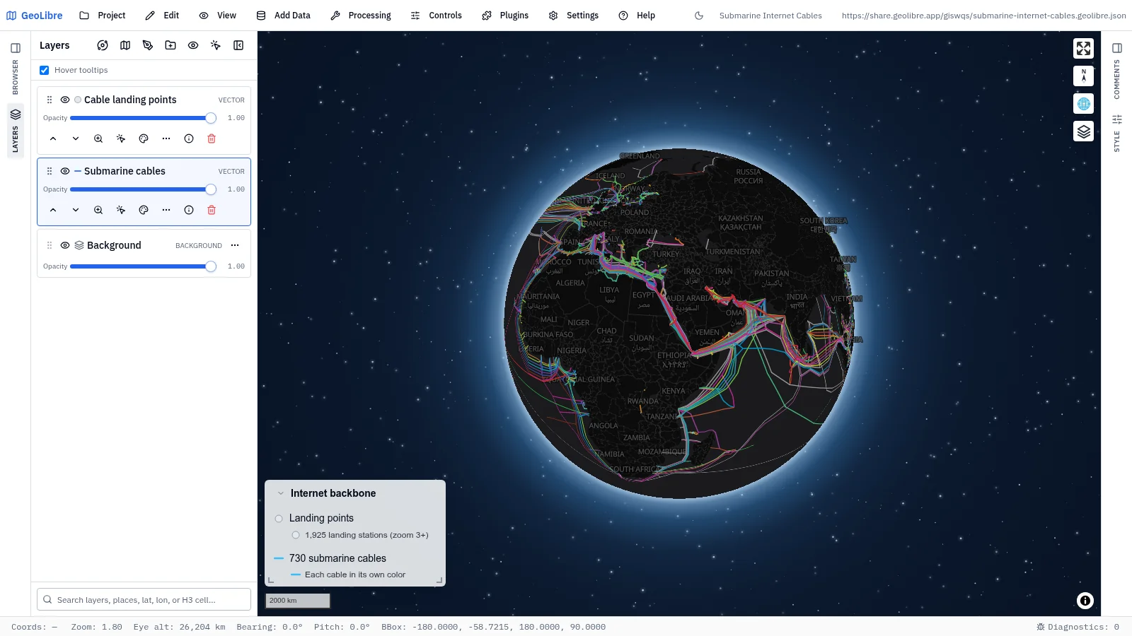
Submarine internet cables Connectivity · 730 cables in their own colors, with 1,900+ landing stations Data: TeleGeography |
 |
 |
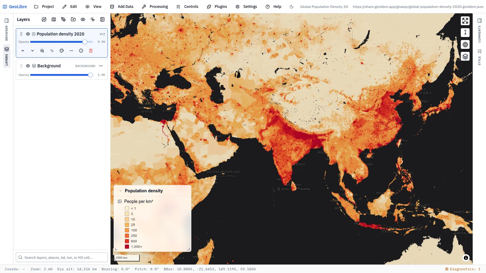
| Global population density 2020 Human footprint · People per km² on a gridded raster Data: NASA SEDAC GPW v4 |
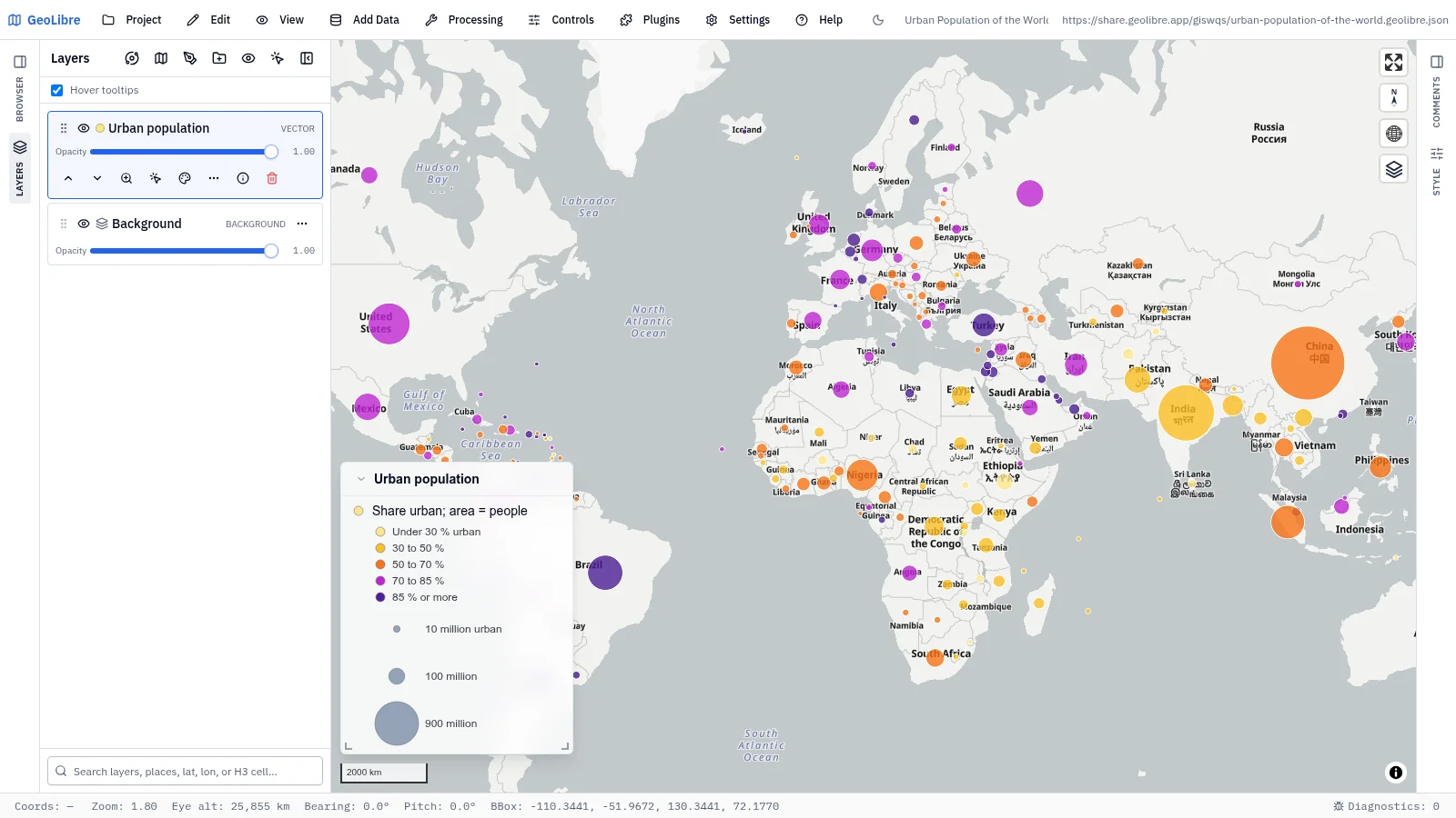
Urban population of the world Development · Circle area is urban population, color is the share of people in cities Data: World Bank |
 |
 |
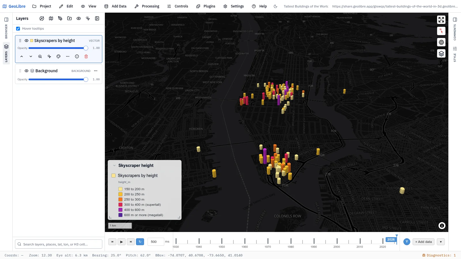
| Tallest buildings of the world in 3D Infrastructure · 733 towers of 150 m or more at true height, rising year by year Data: Wikidata |
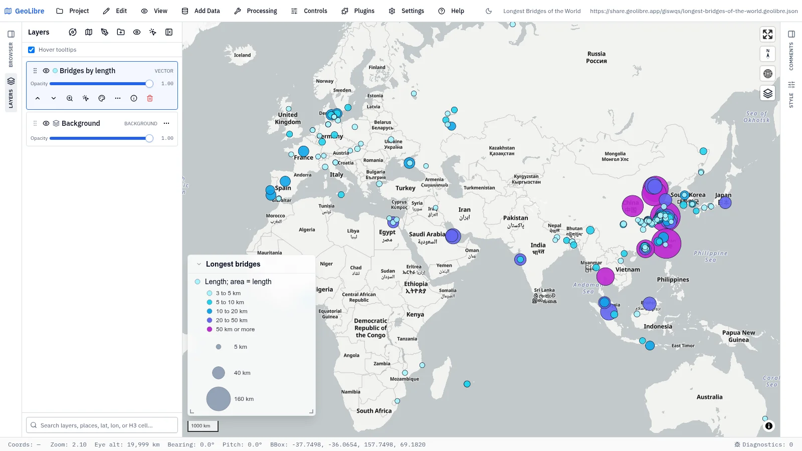
Longest bridges of the world Infrastructure · 224 bridges over 3 km sized by length, with photos Data: Wikidata, Wikimedia Commons |
Energy
5 projects · Filter by the energy tag
 |
 |
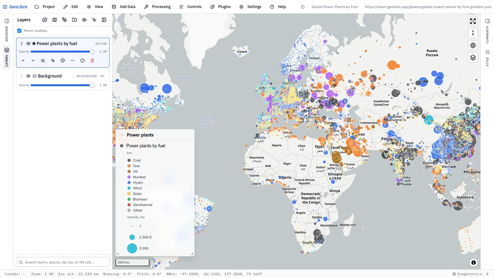
| Global power plants by fuel Energy · 35,000 plants colored by primary fuel and sized by capacity Data: WRI Global Power Plant Database |
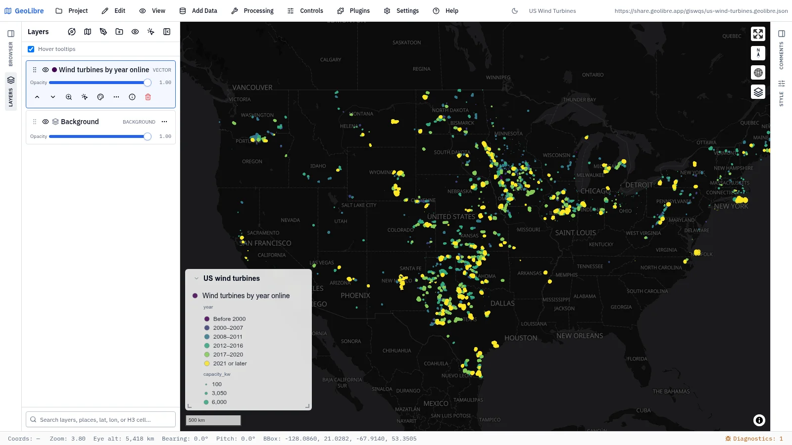
US wind turbines Energy · 76,000 turbines colored by year online and sized by capacity Data: US Wind Turbine Database (USGS, LBNL, ACP) |
 |
 |
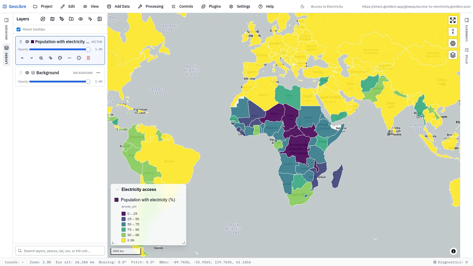
| Access to electricity Development · Share of each country's population with electricity, latest year Data: World Bank WDI |
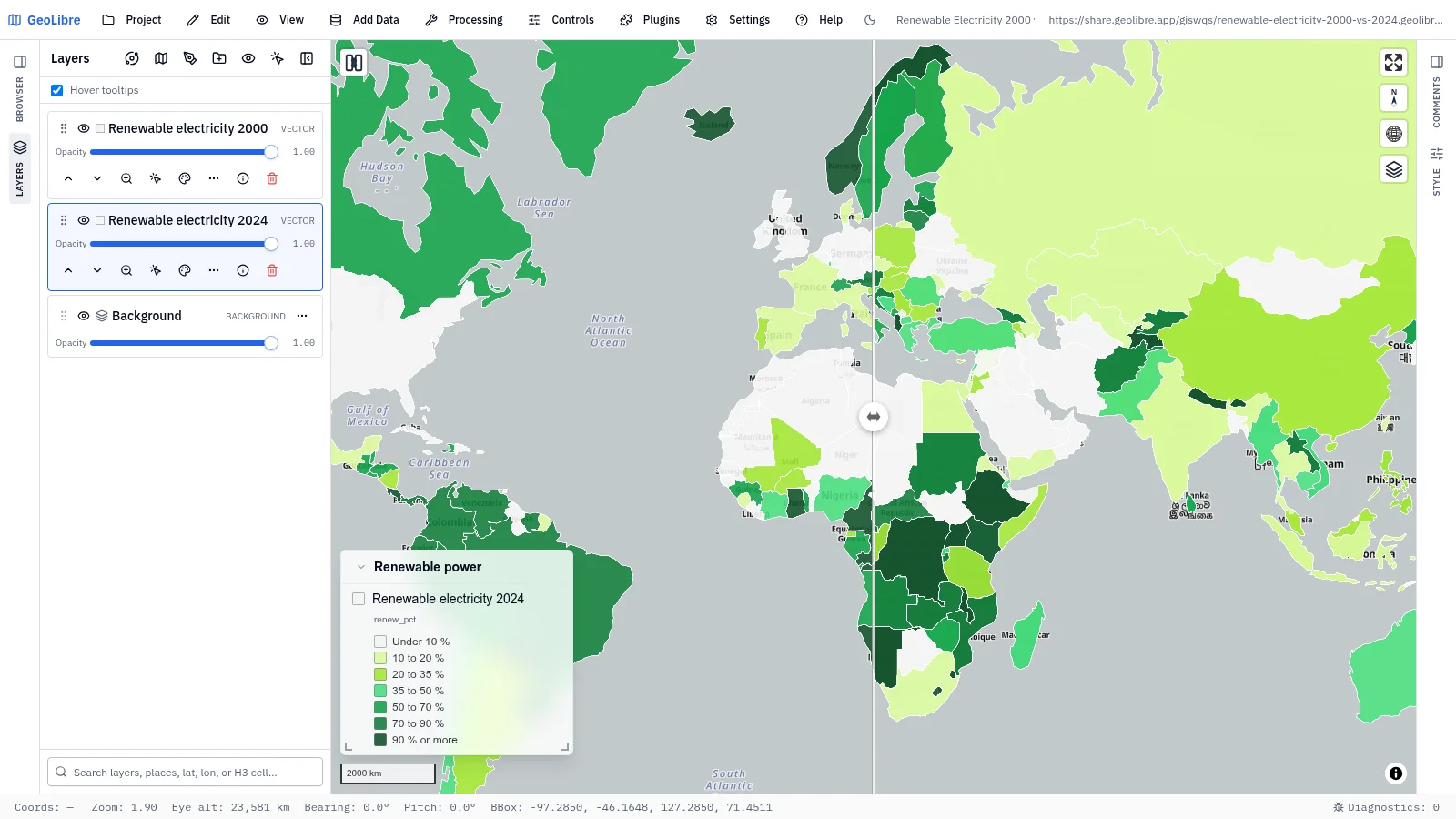
Renewable electricity, 2000 vs 2024 Energy · Share of power from renewables: swipe 2000 against 2024 Data: Our World in Data (Ember, EI) |
 |
|
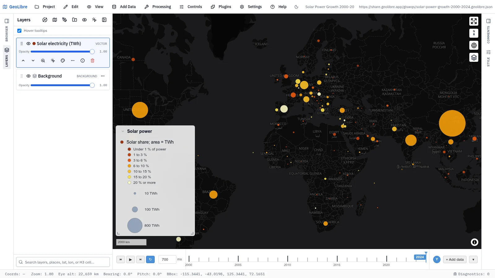
| Solar power growth, 2000–2024 Energy · Solar generation by country on a time slider: watch the circles grow Data: Our World in Data |
Space and Earth observation
5 projects · Filter by the space tag
 |
 |
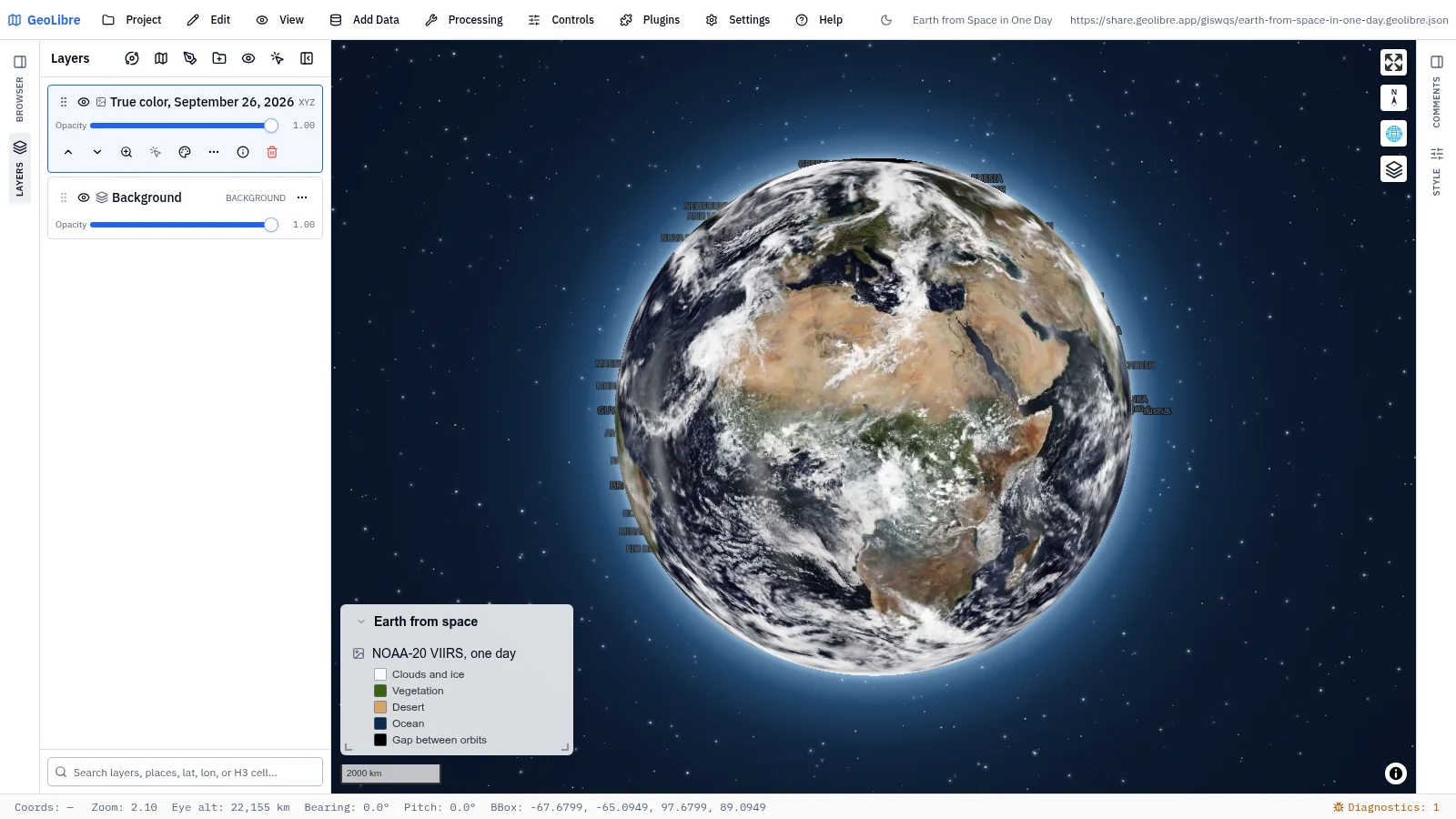
| Earth from space in one day Earth observation · The whole planet in true color from one day of NOAA-20 orbits Data: NASA GIBS (VIIRS) |
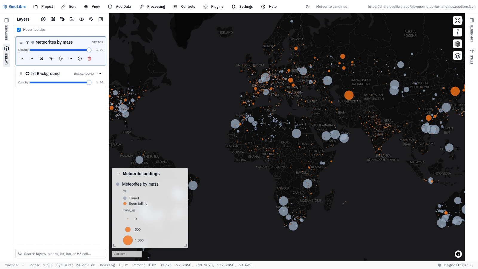
Meteorite landings Space · 32,047 meteorites sized by mass and split into observed falls and finds Data: NASA, Meteoritical Society |
 |
 |
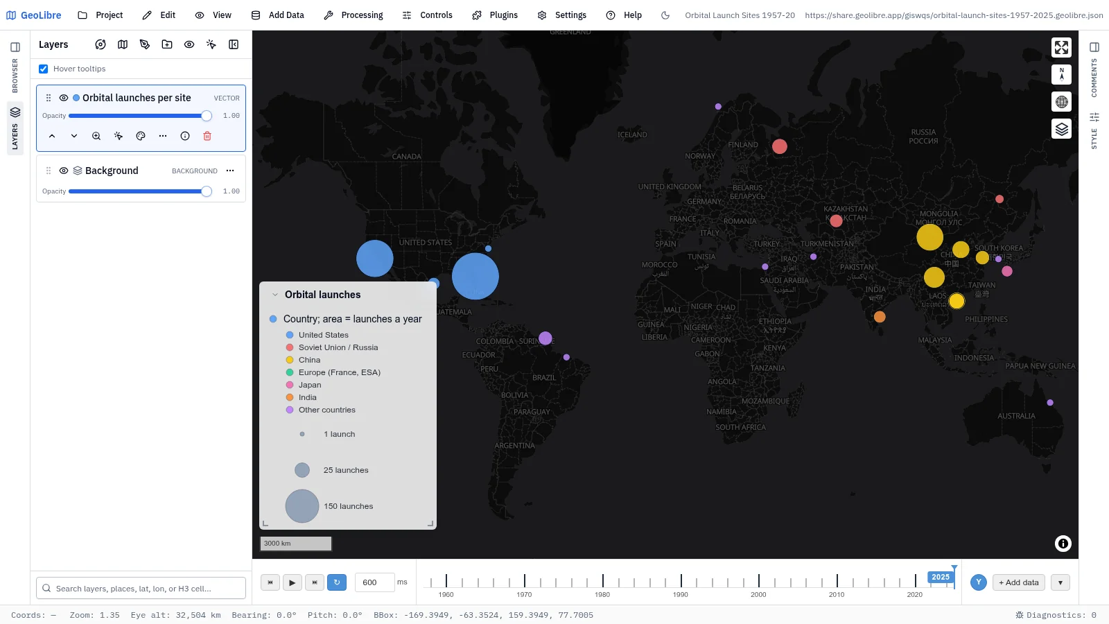
| Orbital launch sites, 1957–2025 Space · Orbital launches per site and year from Sputnik to 2025 Data: GCAT (J. McDowell) |
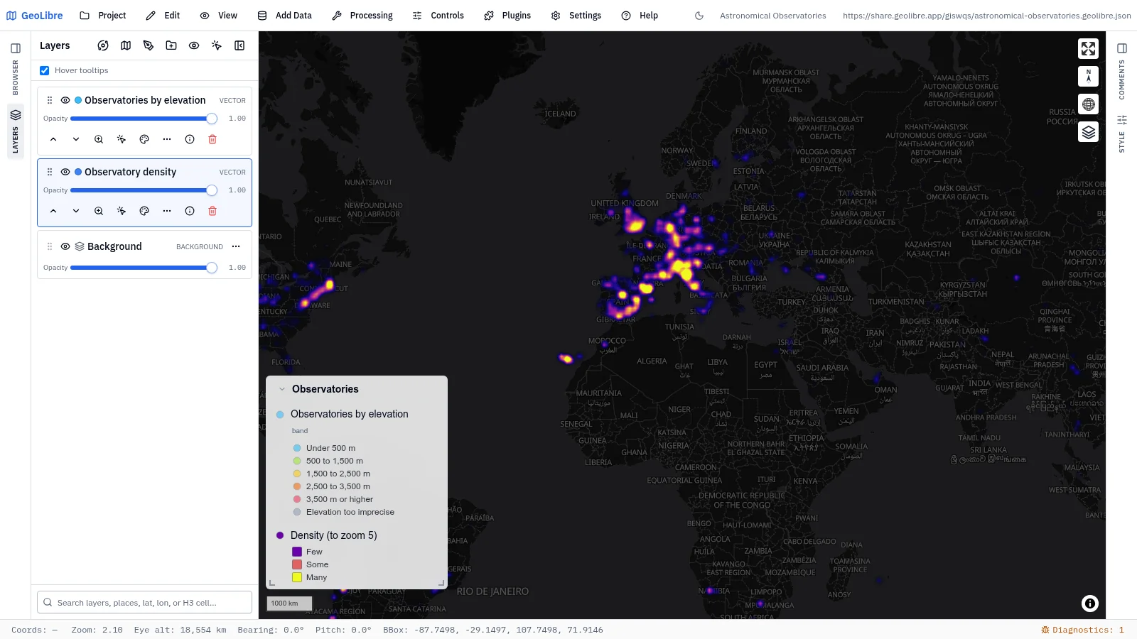
Astronomical observatories Space · 2,693 observatories as a heatmap that resolves into sites by elevation Data: IAU Minor Planet Center |
 |
|
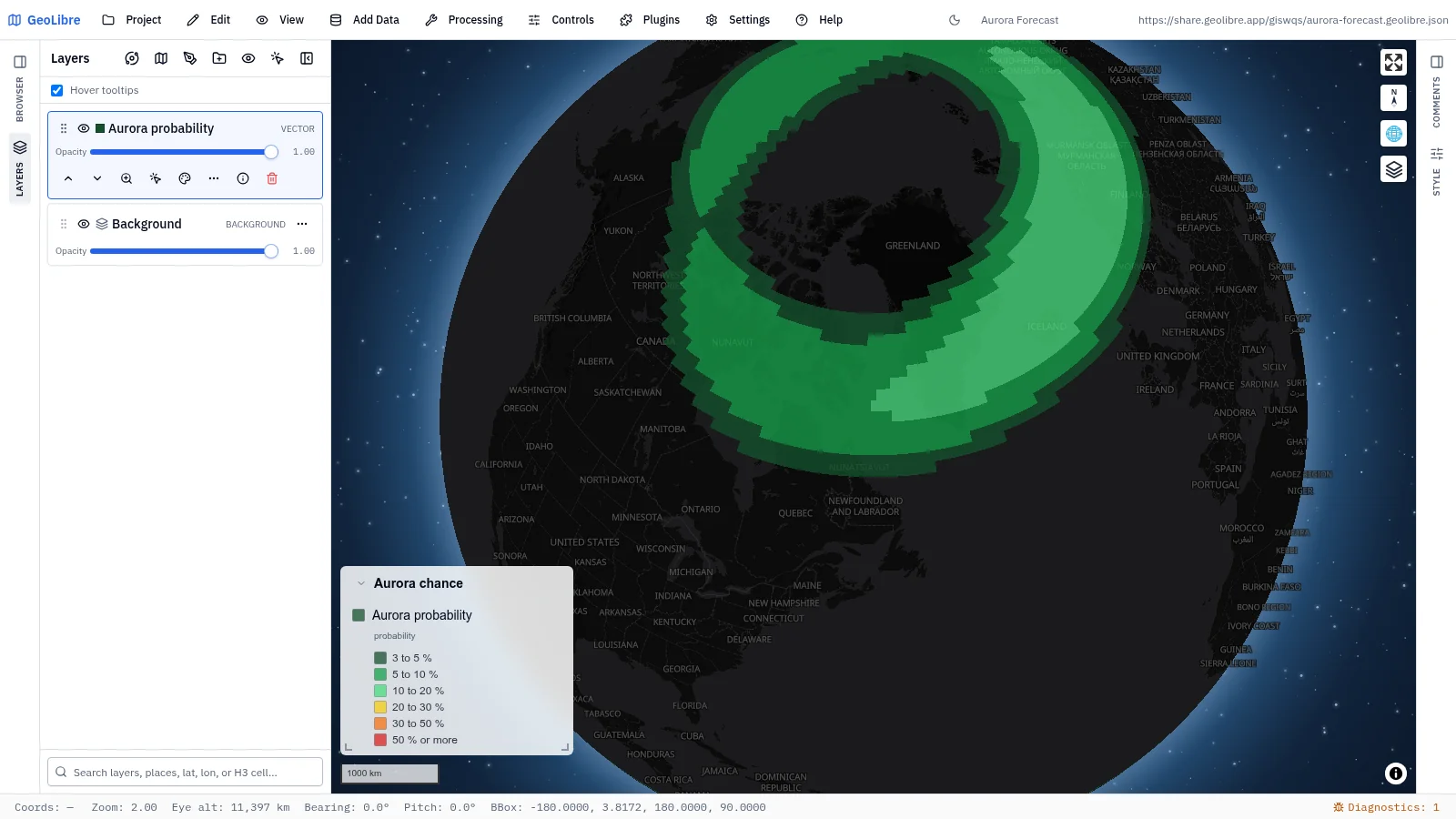
| Aurora forecast Space weather · The chance of seeing an aurora, a snapshot of the OVATION model Data: NOAA SWPC |
History and culture
12 projects · Filter by the history-culture tag
 |
 |
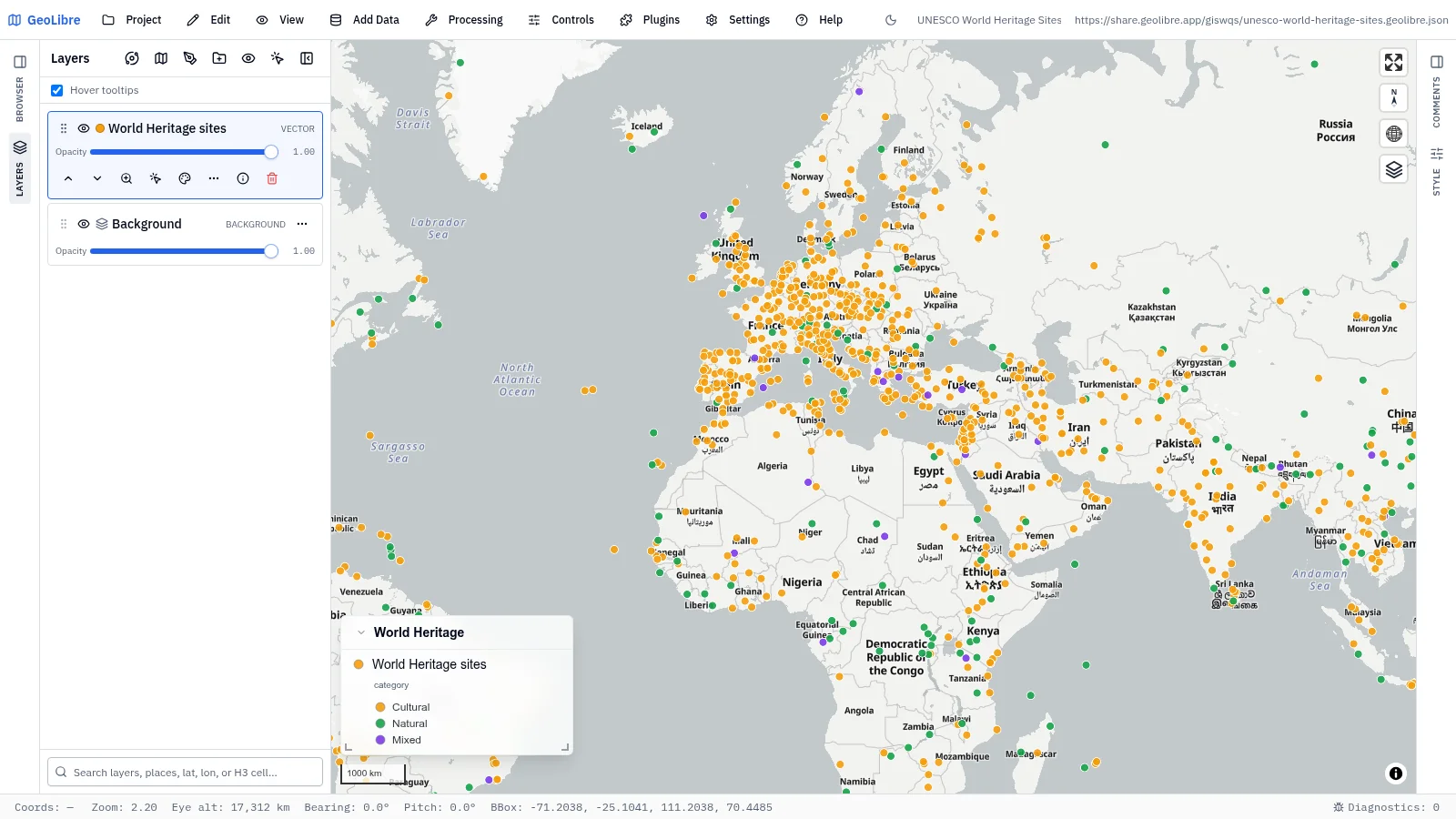
| UNESCO World Heritage sites Culture · All inscribed properties by category, with photos in the popups Data: UNESCO World Heritage Centre |
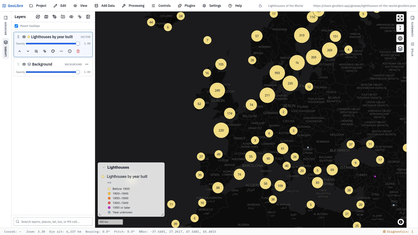
Lighthouses of the world Culture · 9,567 lighthouses in clusters that split into towers colored by year built Data: Wikidata |
 |
 |
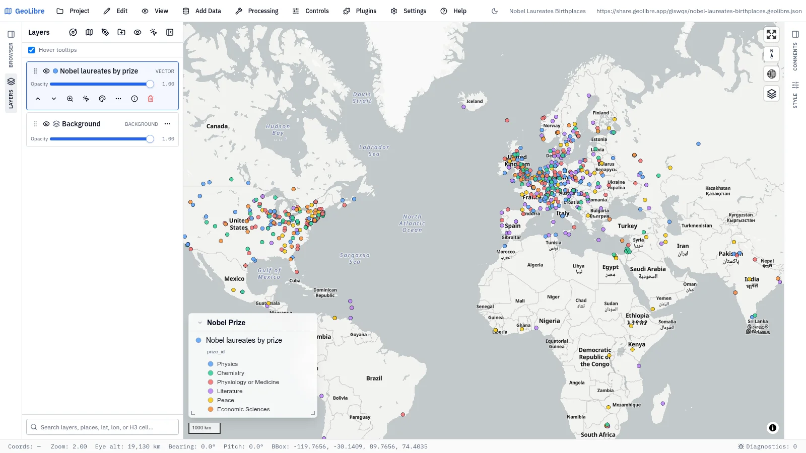
| Nobel laureates birthplaces Culture · Birthplaces of 990 Nobel laureates, colored by prize Data: Wikidata |
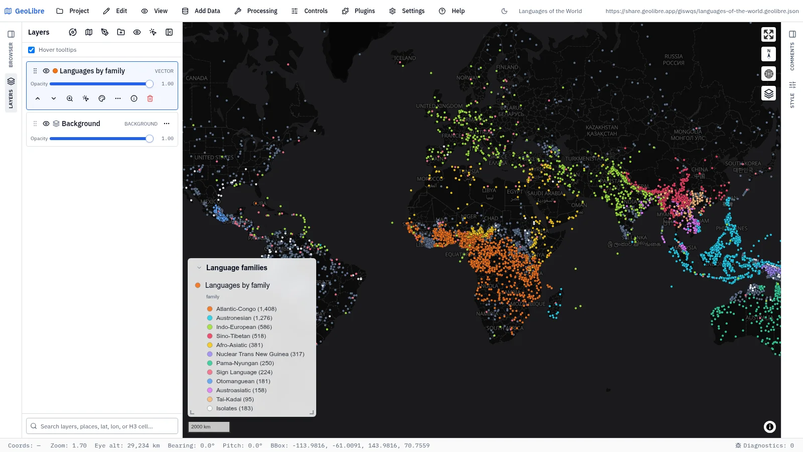
Languages of the world Culture · 7,896 languages colored by family Data: Glottolog |
 |
 |
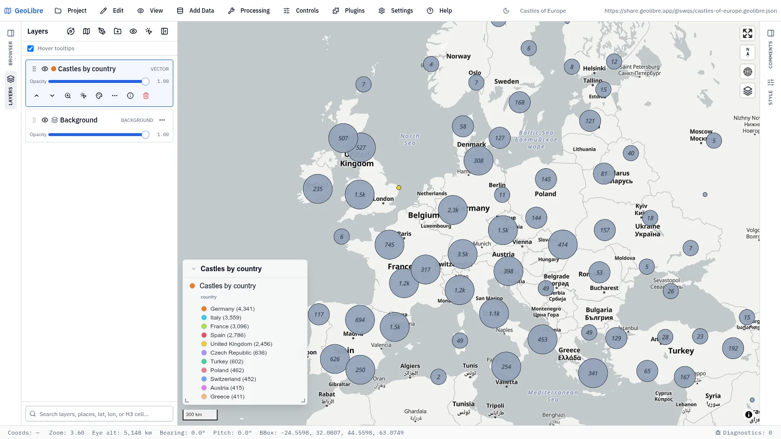
| Castles of Europe History · 22,033 castles in clusters; click one for its photo Data: Wikidata, Wikimedia Commons |
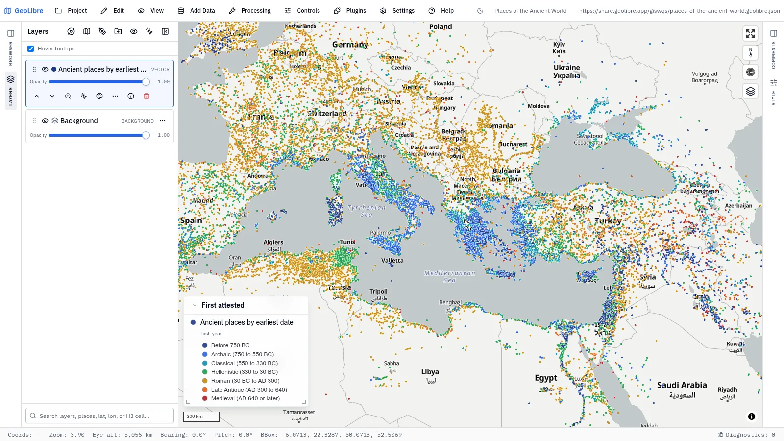
Places of the ancient world History · 31,314 ancient places colored by the period they are first attested Data: Pleiades (ISAW, NYU) |
 |
 |
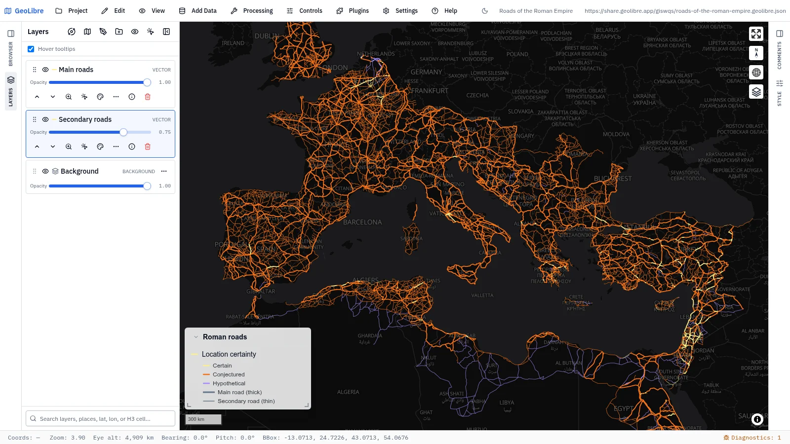
| Roads of the Roman Empire History · About 300,000 km of Roman roads by how certain the route is Data: Itiner-e |
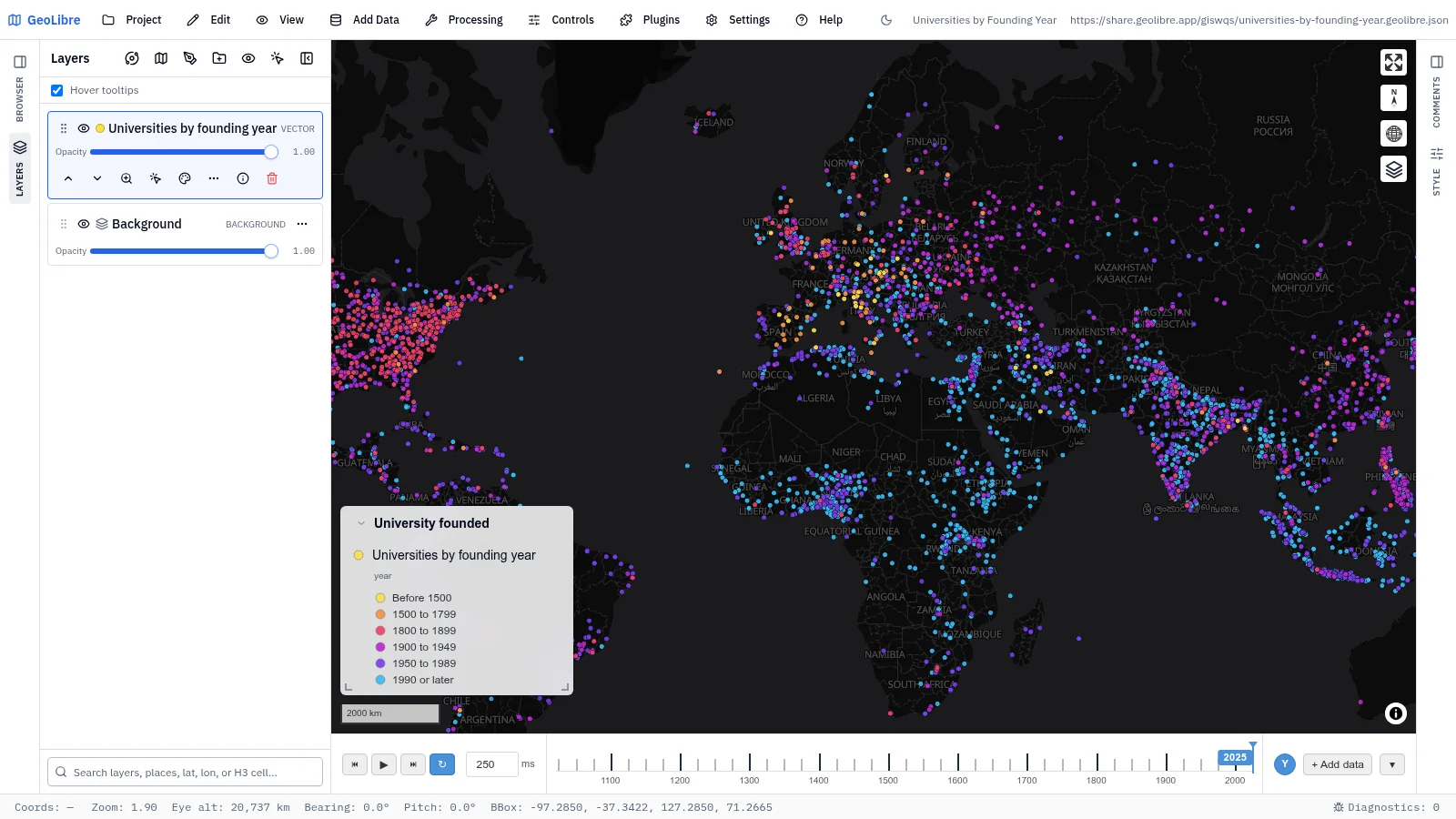
Universities by founding year Education · 8,674 universities build up from the Middle Ages to today Data: Wikidata |
 |
 |
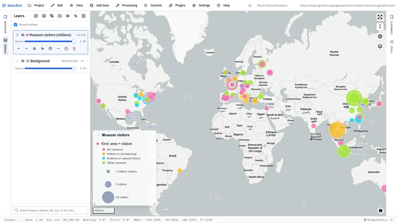
| Most visited museums Culture · 116 museums with at least 1 million visitors a year, with photos Data: Wikidata |
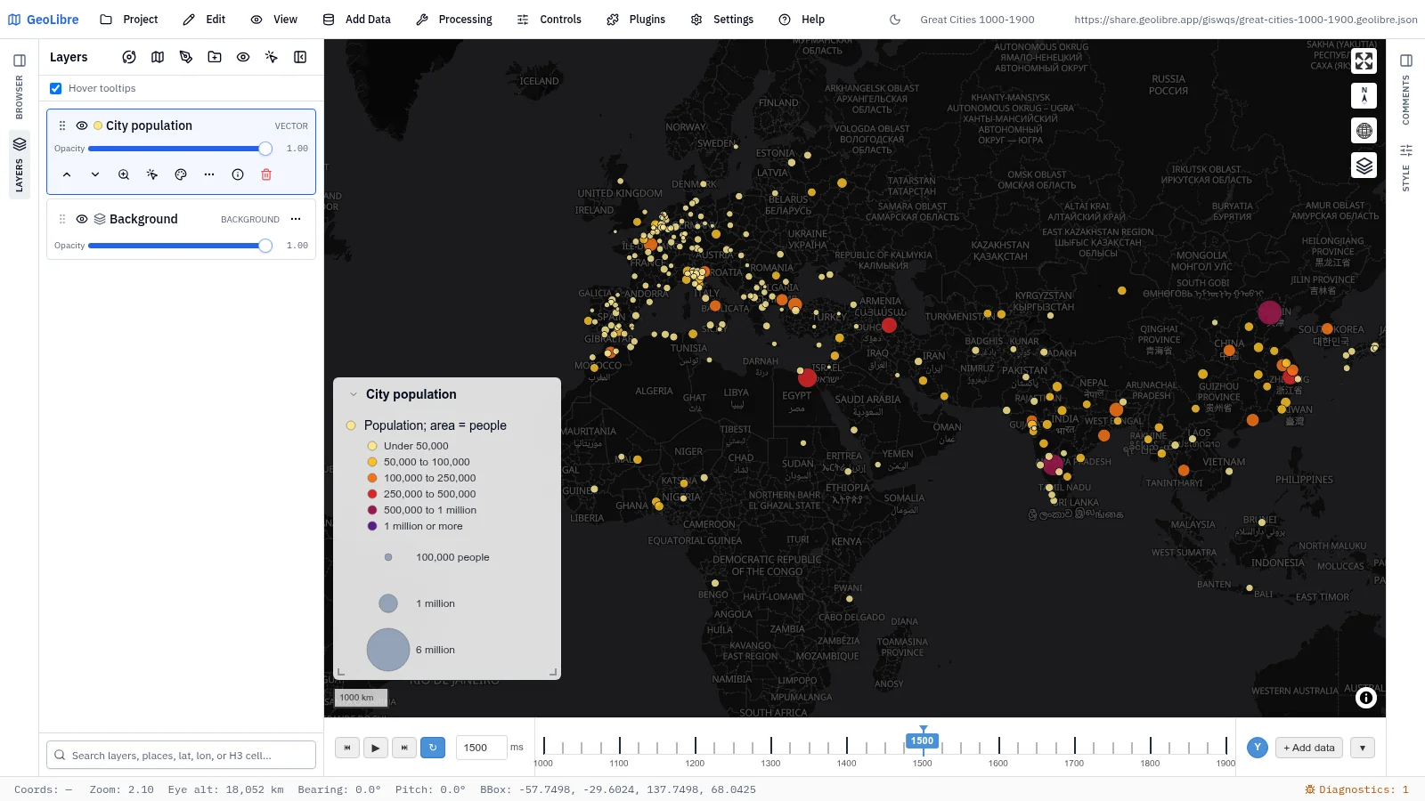
Great cities, 1000–1900 History · City populations century by century on a time slider Data: Chandler via Reba et al. 2016 |
 |
 |
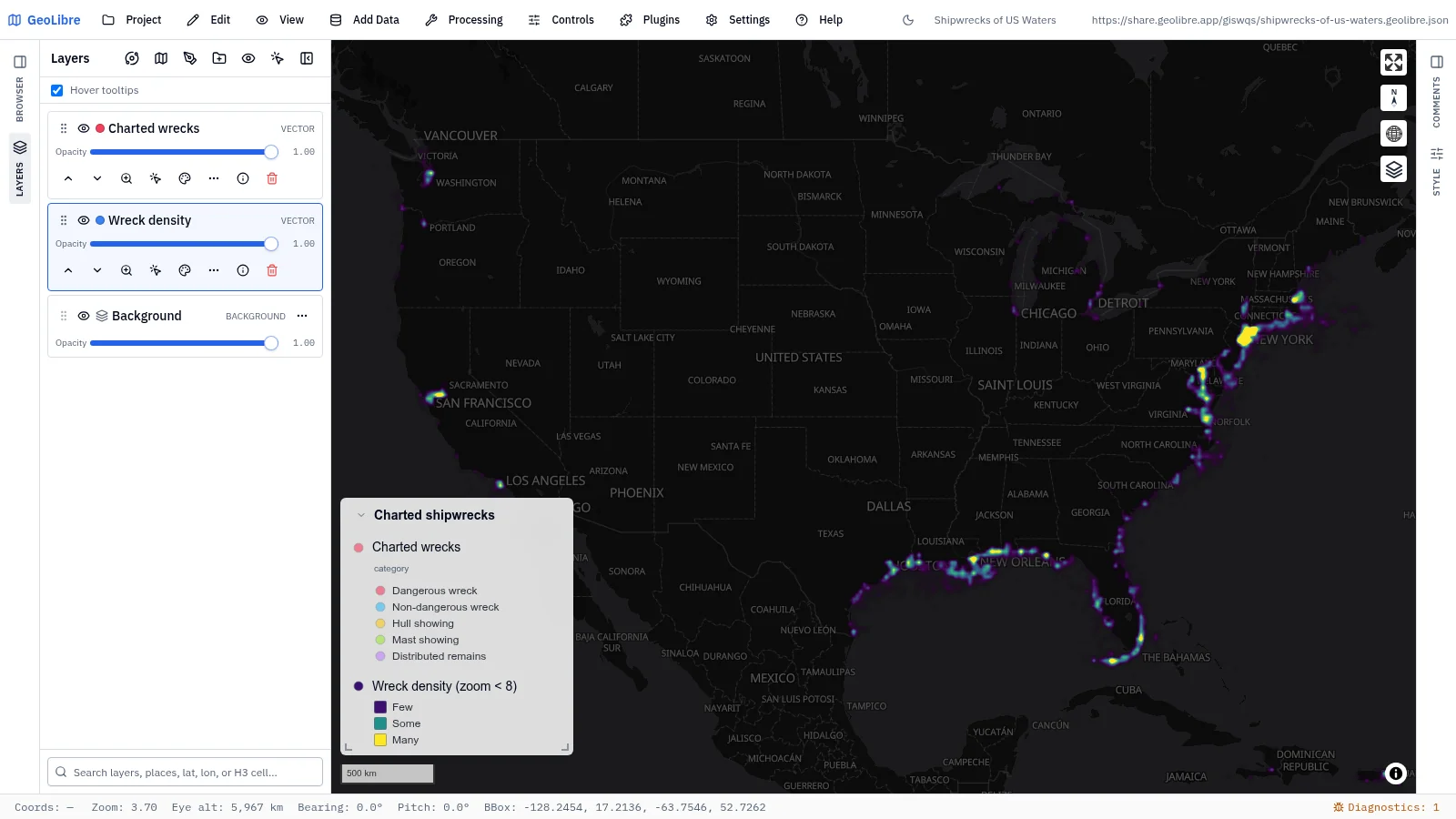
| Shipwrecks of US waters History · 11,234 charted wrecks as a heatmap that resolves into points Data: NOAA ENC Direct |
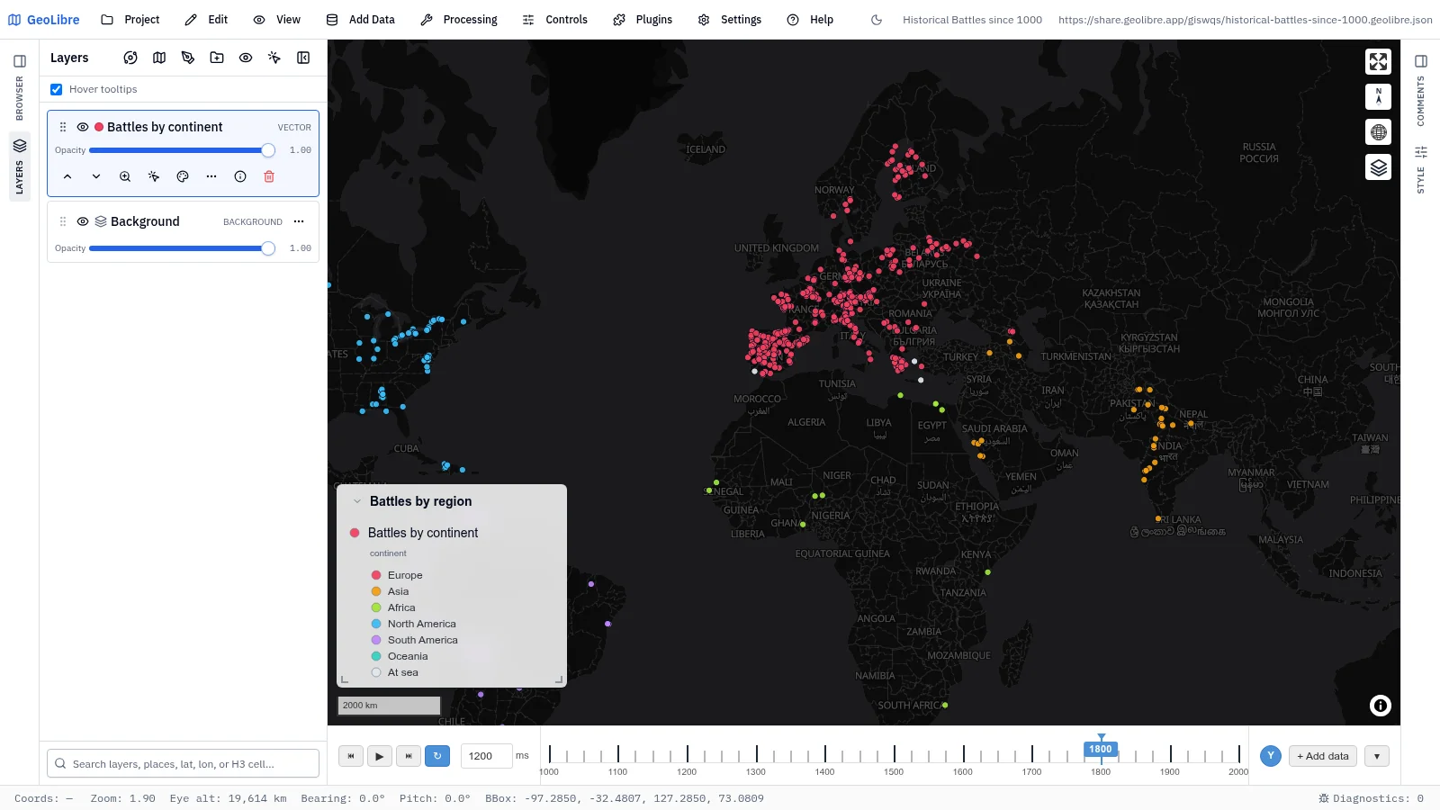
Historical battles since 1000 History · 7,254 battles, one quarter-century at a time Data: Wikidata |
Society and economy
13 projects · Filter by the society-economy tag
 |
 |
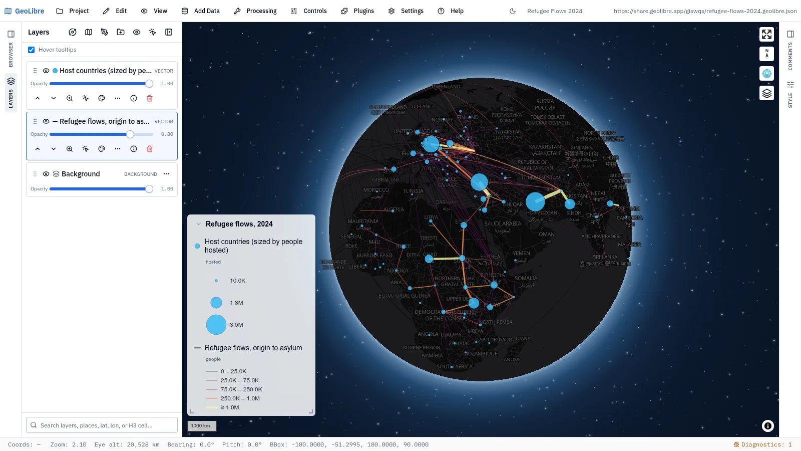
| Refugee flows 2024 Human mobility · The 400 largest origin-to-asylum flows as great circles, hosts sized by people hosted Data: UNHCR Refugee Data Finder |
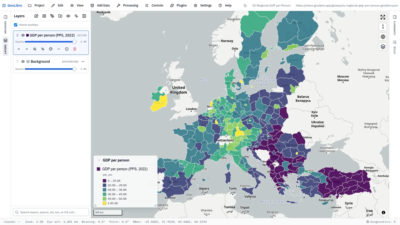
EU regional GDP per person Economy · GDP per inhabitant in PPS for 272 NUTS 2 regions, 2022 Data: Eurostat, GISCO |
 |
 |
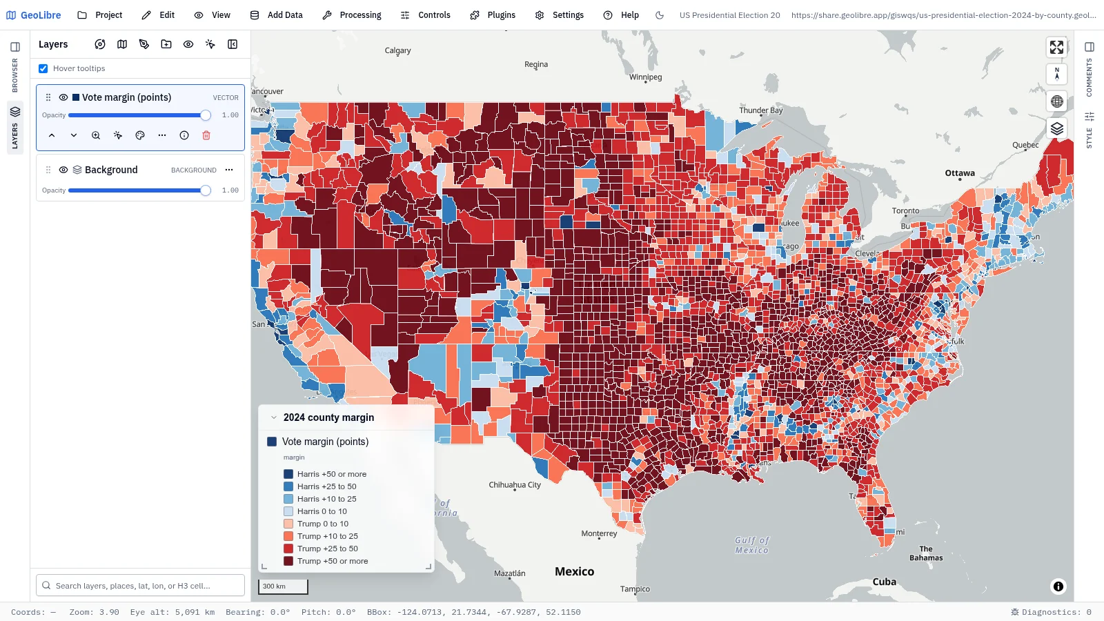
| US presidential election 2024 by county Society · Vote margin in 3,116 counties, in percentage points Data: tonmcg county results, US Census |
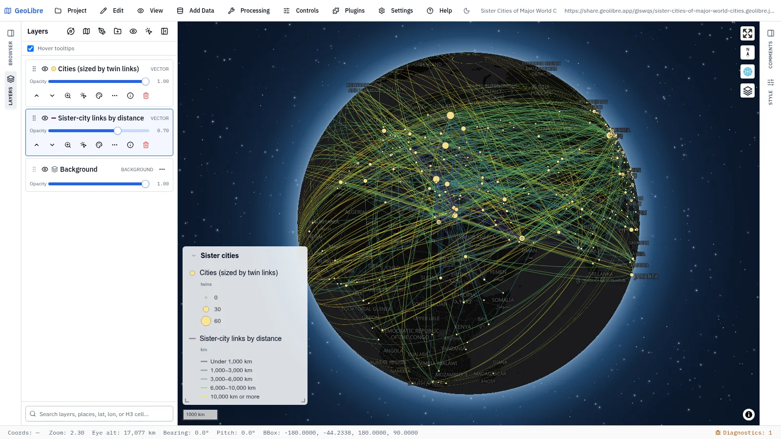
Sister cities of major world cities Society · 1,108 sister-city links as great circles, colored by distance Data: Wikidata |
 |
 |
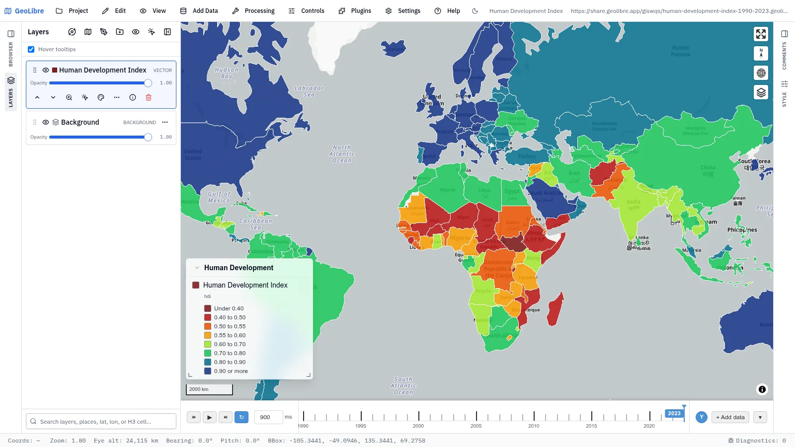
| Human Development Index, 1990–2023 Development · Three decades of human development on a yearly time slider Data: UNDP via Our World in Data |
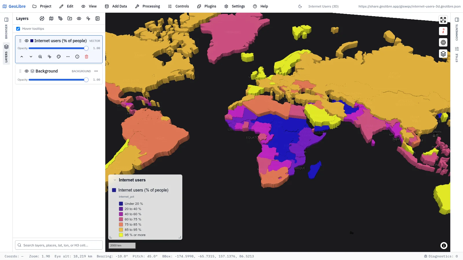
Internet users in 3D Connectivity · Share of people online, extruded in 3D by country Data: World Bank (ITU) |
 |
 |
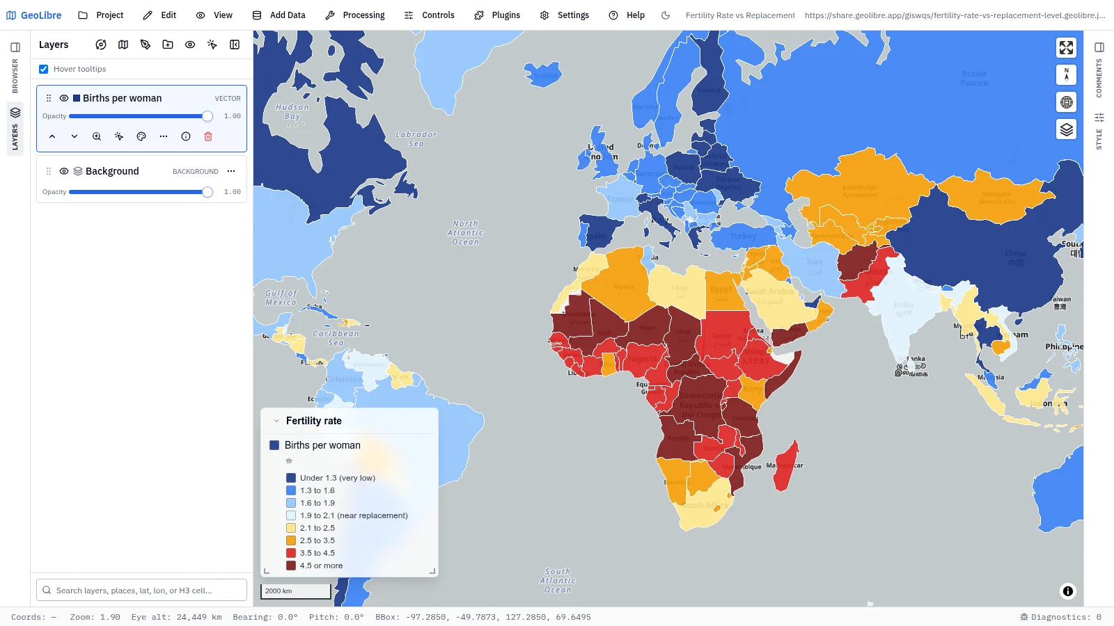
| Fertility rate vs replacement level Population · Births per woman, blue below and red above the replacement level of 2.1 Data: World Bank |
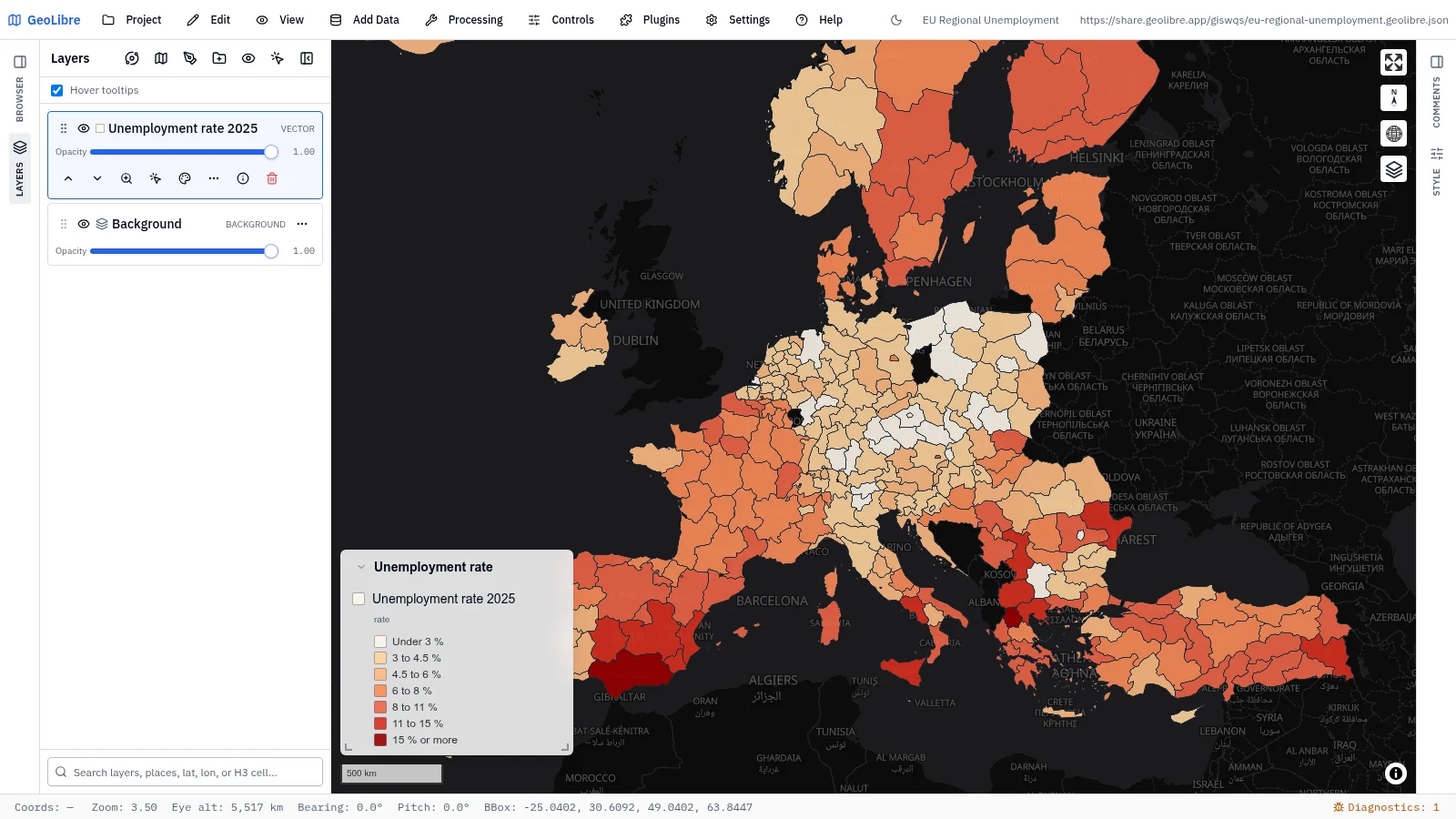
EU regional unemployment Economy · Unemployment in 286 European regions, 2025 Data: Eurostat, GISCO |
 |
 |
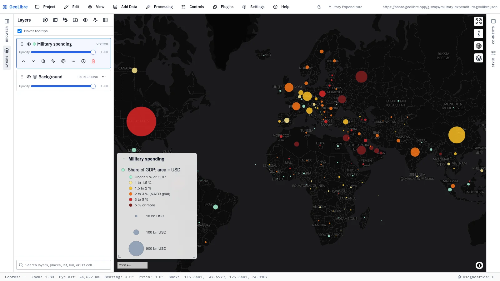
| Military expenditure Economy · Circle area is spending in US dollars, color is the share of GDP Data: World Bank (SIPRI) |
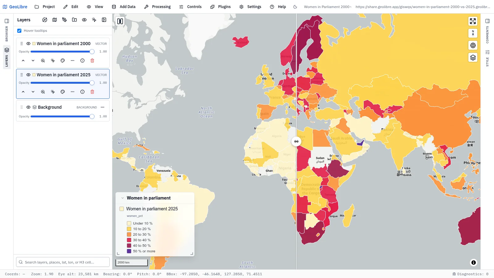
Women in parliament, 2000 vs 2025 Society · Share of parliament seats held by women: swipe 2000 against 2025 Data: World Bank (IPU) |
 |
 |
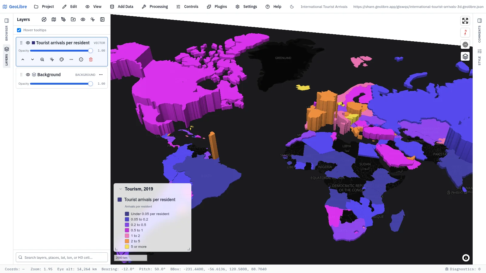
| International tourist arrivals in 3D Economy · 2019 tourist arrivals extruded by total and colored per resident Data: World Bank (UN Tourism) |
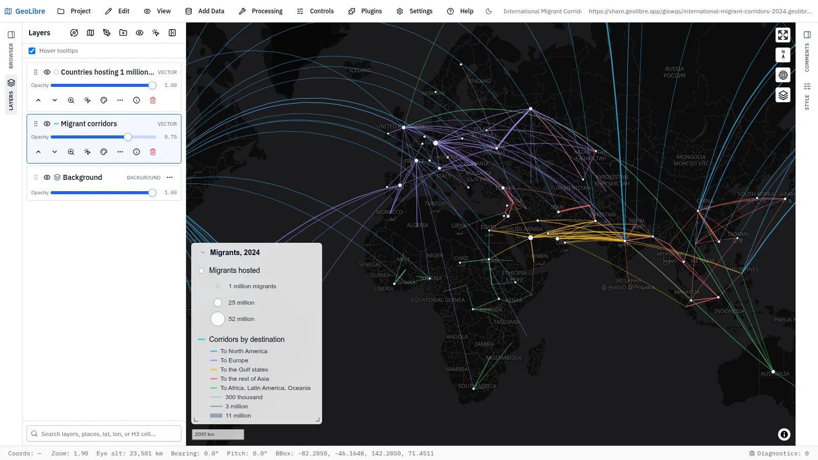
International migrant corridors 2024 Migration · The 250 largest country-to-country migrant corridors as great circles Data: UN DESA |
 |
|
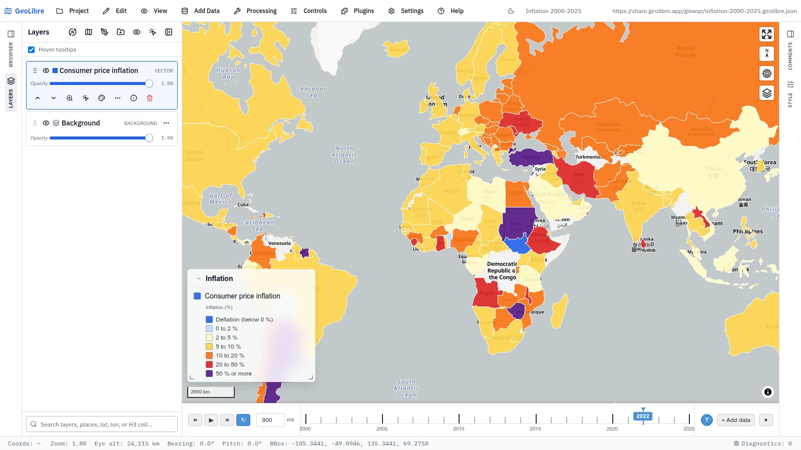
| Inflation, 2000–2025 Economy · Consumer price inflation by country on a time slider Data: World Bank (IMF) |
Food and agriculture
4 projects · Filter by the food-agriculture tag
 |
 |
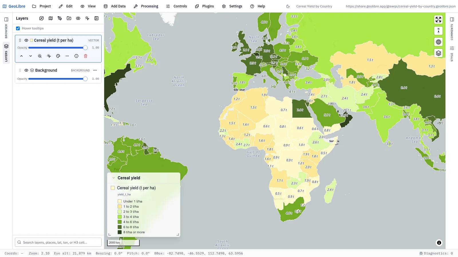
| Cereal yield by country Agriculture · Cereal yield in tonnes per hectare, each country labeled Data: World Bank (FAO) |
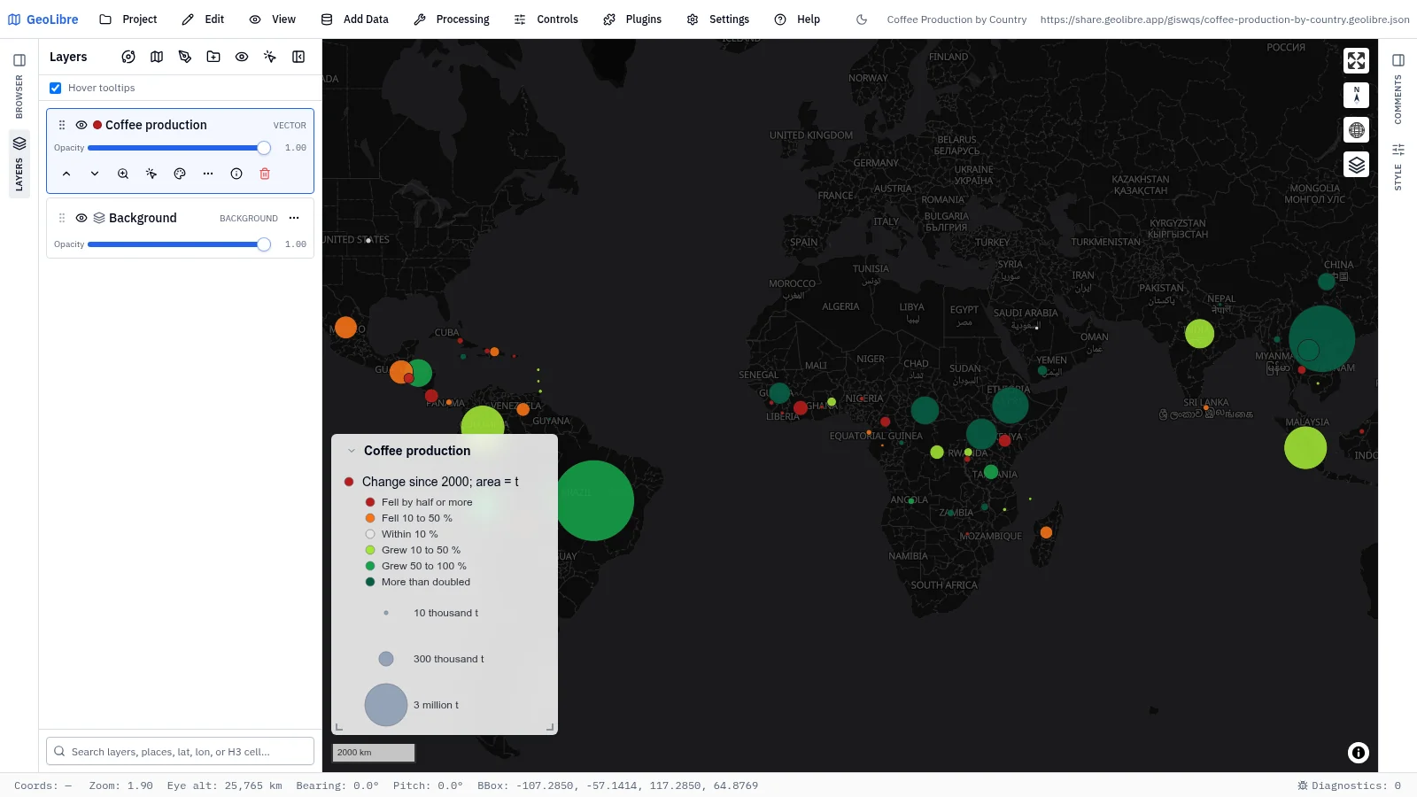
Coffee production by country Food · Green coffee output in 2024 and its change since 2000 Data: FAO via Our World in Data |
 |
 |
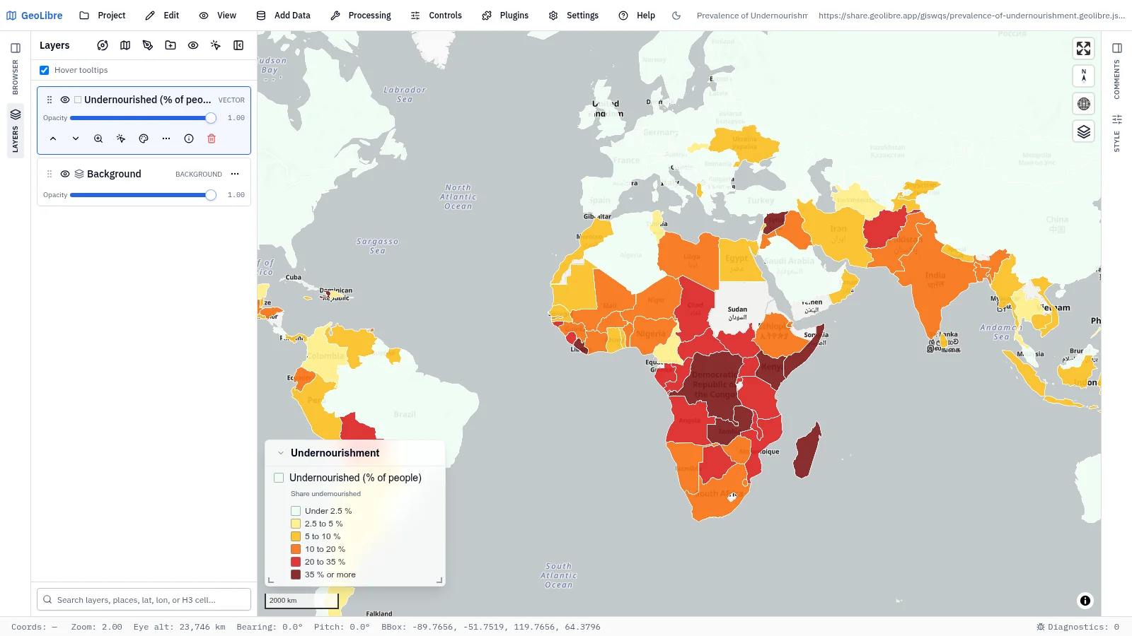
| Prevalence of undernourishment Food security · Share of people who cannot meet their dietary energy needs Data: World Bank (FAO) |
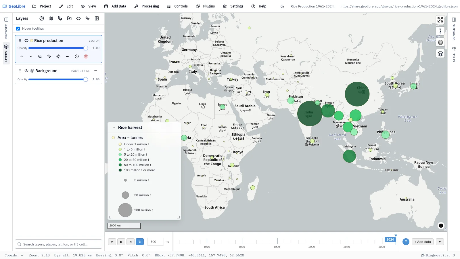
Rice production, 1961–2024 Food · Rice harvests by country on a time slider Data: FAO via Our World in Data |