Styling Layers
The Style panel on the right edits the appearance of the layer selected in the Layers panel. Vector and raster layers each get their own set of controls.
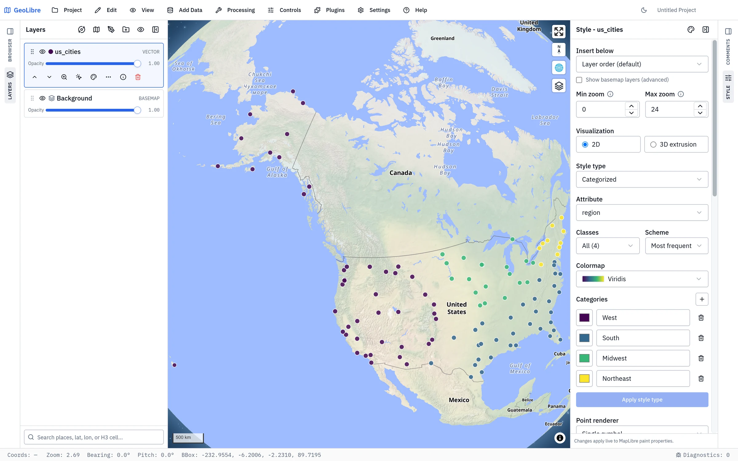
Vector styling
For vector layers the Style panel covers fill, stroke, points, labels, and 3D extrusion:
- Fill: fill color and fill opacity for polygons.
- Stroke: line color and width for lines and polygon outlines.
- Points: circle radius for point layers, or Use marker icon to draw a marker instead: a built-in shape (circle, square, triangle, diamond, star, cross, or pin) with a color and size, or a Custom image. Upload image… accepts SVG, PNG, JPEG, or GIF; raster images draw as they are, so the marker color and per-class colors apply only to SVG markers.
- Labels: text color, size, halo color, and halo width.
- 3D extrusion: turn polygons into extruded blocks, with a height field, height scale, base height, and color. Advanced expressions are available for both height and color.
You can also set a per-style minimum and maximum zoom so a style only applies within a zoom range.
Point renderer (heatmap and clustering)
For point-only GeoJSON layers — whether dropped on the map, produced by a tool, or loaded through Add Vector Layer in the geojson render mode — the Style panel adds a Point renderer control:
| Renderer | Description |
|---|---|
| Single symbol | One circle per point (the default). |
| Heatmap | A density surface colored from cold to hot. Adjust Heatmap radius (the kernel size in pixels) and Heatmap intensity. |
| Clustered | Group nearby points into bubbles labeled with the count; zooming in splits them apart. Adjust the Cluster radius (in pixels) and the Cluster max zoom above which points stop clustering. Individual (unclustered) points keep the layer's circle style. |
The renderer choice is saved with the project.
Style type (data-driven styling)
The Style type control chooses how feature values map to color:
| Style type | Description |
|---|---|
| Single symbology | One uniform style for every feature. |
| Graduated | Classify a numeric attribute into classes and colour them from a ramp. |
| Categorized | Give each of an attribute's distinct values its own colour. |
| Rule-based | Build a list of rules, each with its own filter, symbol properties, and optional scale-dependent visibility. |
| Advanced expression | Drive styling with a custom MapLibre expression for full control. |
Graduated and categorized styles share four more controls, and then list the generated stops so you can fine-tune an individual colour before applying:
- Attribute — the field the style reads.
- Classes — 2 to 12 classes for a graduated style; 1 to 12 for a categorized one, plus an All (n) option that gives every distinct value its own colour.
- Scheme — how the stops are chosen. Graduated offers Equal interval, Quantile, Natural breaks, Standard deviation, Geometric interval, and Manual; categorized offers Most frequent, Alphabetical, and First values.
- Colormap — the named colour ramp the classes are drawn from.
Nothing reaches the map until you click Apply style type, so you can adjust the classification and watch the stop list update first.
The graduated schemes differ in where they put the class breaks:
- Standard deviation centres classes one standard deviation wide on the mean, so it shows how far each feature is from average. An even class count puts a break on the mean; an odd count gives a middle class that straddles it. Breaks that would fall outside the data's range are dropped, so you can get fewer classes than you asked for. A diverging colormap suits it.
- Geometric interval grows the breaks by a constant ratio from the smallest positive value to the maximum, which suits skewed data spanning orders of magnitude (population, income, concentrations). Zero and negative values fall into the first class; if no value is positive, it classifies by equal interval instead.
- Manual is set for you as soon as you edit a class value, add a class, or remove one, so the method shown never claims to have produced breaks you typed. Choose it yourself to keep the current breaks while you edit them. Changing the class count, colormap, or attribute regenerates the breaks by equal interval.
The map legend names the method under a graduated layer's field, for example "Quantile, 5 classes", so a reader of an exported or shared map can tell how the classes were built. A project saved before the Manual scheme existed keeps the method it was classified with even if its breaks were edited by hand afterwards; reapply the classification, or pick Manual, to correct the caption.
Diagram symbology
Below the renderer controls, a Diagram control draws a small chart on each feature instead of (or as well as) a plain symbol: Pie chart, Donut chart, Bar chart, or Stacked bar chart, built from the numeric fields you pick. Set it to None to turn diagrams off. It is the usual way to show a composition — vote share, land-cover mix, age structure — per polygon or per point.
Quick filters
Below the renderer and label controls, the Quick filters section narrows what the layer draws without writing an expression. Pick a field from Add a filter... and GeoLibre reads the data to decide which control it deserves:
- a Values list of checkboxes with a count beside each value (with a search box once there are more than a handful),
- a Range slider plus typed minimum and maximum for a numeric field,
- a Dates from/to pair for a timestamp field, with both days included in full,
- a Text match — contains, starts with, or is exactly — which ignores case.
The Filter type dropdown beside a field switches between the controls it
supports, so a numeric code column that opens as a range can be answered with
checkboxes instead. Several filters on one layer narrow it together, and they
combine with a Time Slider window, an embed setFilter, and rule-based
symbology rather than replacing them.
A quick filter hides features; it does not select them. Select by Expression
can either build a live selection or apply a persistent expression filter to the
layer. The latter provides definition-query behavior without creating a copy of
the matching features. A saved filter keeps the expression itself live but not
the builder's @ variables: @map_zoom, @map_scale, @feature_count,
@project_name, and @layer_name are replaced by their values when you click
Filter layer. Write ["zoom"] rather than @map_zoom when the filter
should keep responding to the camera.
A layer with an active filter shows a funnel icon on its row in the Layers panel, so a filtered layer is never mistaken for missing data, and its Layer actions -> Clear filters empties every control at once while keeping the controls themselves. Clearing the last checkbox in a Values list is the same as clearing that filter: it shows every value, not none. Remove all at the top of the section deletes the controls outright.
Filters are saved with the project, so a shared map opens with the same view of
the data. Quick Filter controls also appear in the read-only viewer chrome
(?layout=viewer), so the person you shared it with can adjust those controls
even though the authoring panels are hidden. A persistent expression filter has
no control to offer there, but the layer still carries the funnel icon, so a
viewer can see that features are being held back rather than missing.
Tile-backed layers (vector tiles, PMTiles, MBTiles) carry no local features, so their value lists are read from the tiles currently loaded and grow as you pan and zoom; the section says so under the controls.
One limit is worth knowing, and it now cuts two ways. MapLibre builds clusters
at the source, before the renderer evaluates any filter. A persistent expression
filter and Quick Filters are applied to a clustered layer's source data first,
so its bubbles and counts do follow them. A Time Slider window, a rule-based
filter, and an embed setFilter stay per-feature render filters, so while
clustering is on the bubbles and their counts still describe data those have not
narrowed. Switch the point renderer back to Single symbol to see the
filtered features drawn individually, one circle each, with no cluster counts to
misread.
Style interchange and URL styles
The selected vector layer's Layer actions → Styles submenu imports and exports GeoLibre URL style JSON, Mapbox/MapLibre style JSON, OGC SLD, and QGIS QML. A GeoLibre URL style is a compact MapLibre style whose feature data is supplied separately through the data URL parameter. Use Export GeoLibre URL style when you want to publish the current symbology beside hosted GeoJSON or a ZIP of GeoJSON files; import it when you want to apply that symbology to a layer already open in GeoLibre.
GeoLibre URL styles preserve built-in polygon fill patterns and their colors, plus custom SVG fill patterns. Inline SVG markup and SVG data URLs are stored in the style file; HTTP(S) SVG URLs remain external references and must still be reachable when loading the style. Each fill render layer carries a versioned geolibre:fill-pattern entry in its metadata, so patterns stay associated with the correct source when combining styles for a multi-file ZIP. GeoLibre restores this extension through both URL loading and style import. Other MapLibre/Mapbox clients ignore the extension and use the flat fill. Custom point markers still require generated sprites and are not preserved by this export.
See Managing Layers for the menu workflow and Embedding & Sharing for the JSON conventions.
To restyle many layers at once, Project → Export → Export Layer Styles... writes every layer's style to one file keyed by layer name, and Project → Import → Import Layer Styles... applies it to the layers whose names match. See Projects.
Choropleth maps
To make a choropleth, select Graduated, pick a numeric attribute, choose a colormap, and click Apply style type. See the Your First Map tutorial.
Popups and hover tooltips
Further down the Style panel, the Popup section designs what a viewer sees when they interact with a feature, rather than the raw column dump the Identify popup shows by default. It matters most for a map you share: a layout=viewer embed, a shared project, or a story-map chapter, where the recipient clicks a feature and would otherwise get join artifacts, editor-tracking columns, and internal ids alongside the fields you meant them to read.
- Show popup on click (Identify) and Show tooltip on hover are independent switches. The click popup is on by default; the hover tooltip is off.
- Title field leads the popup with the feature's own name rather than the layer's. Title expression does the same from an expression, and wins over the field.
- Body expression replaces the whole popup body — the field rows and the feature id row with them — with a sentence built from the feature's properties, for authors who want prose rather than a table. Both boxes open the same expression builder that backs data-driven styling, labels, and filters.
- Fields chooses which attributes appear and in what order. Add a field from the picker, drag its handle (or use the arrow buttons) to reorder, and give it a Label to show instead of the raw column name. Leave the list empty — or remove every field you added — to keep the default: every visible field, in the data's own order.
- Value type formats the value: Number (decimals, thousands separator), Date (date, date and time, time, ISO 8601, or year), Link, Image, or plain Text. For Text, Number and Date fields, Prefix and Suffix wrap the result, which is where a currency symbol or a unit goes.
- In hover tooltip puts a field in the tooltip's short subset. Keep it to one or two fields: the tip follows the pointer, so it is a glance, not a table. Image fields are skipped there and stay in the click popup, where there is room to show the picture.
Layers loaded through Add Vector Layer are designed here too, once the panel has handed them over to GeoLibre, which it does for every layer it loads in GeoJSON mode with up to 100,000 features (see Adding data). A layer the panel keeps, such as a tiled or streamed one, has no features in GeoLibre for the designer to read, so the Popup section does not appear for it. The panel's own Popup checkbox opens a separate, unstyled attribute table on click; it is off by default so the two do not both answer the same click. Tick it only if you want the control's raw table back.
Fields you hid or excluded from the attribute table stay out of the popup: the popup design selects from the visible fields and cannot re-expose a hidden one. A layer with nothing configured behaves exactly as before, and the whole design saves with the project, so it travels to the Python package and the MCP authoring tools as well.
Raster styling
For raster layers the Style panel exposes image adjustments:
- Brightness (minimum and maximum)
- Saturation
- Contrast
- Hue Rotate (in degrees)
These let you tune the look of GeoTIFF, COG, and tile-based raster layers without changing the underlying data.
A WMS layer also gets a Legend section. Get legend shows the service's legend image, from the capabilities LegendURL when one is advertised or a GetLegendGraphic request otherwise; if the service has none, you can enter a legend image URL instead. Add to map places the legend on the map in an HTML control.
Raster symbology and histogram stretch
GeoTIFF and COG layers add a Raster symbology section with a Render mode:
- Single band (pseudocolor) draws one Band through a colormap, which can be reversed or replaced with your own colors, and optionally Classify into discrete classes (equal interval, quantile, or manual breaks).
- RGB composite maps three bands to red, green, and blue.
- Index (normalized difference) computes an index such as NDVI from two bands.
Min and Max set the stretch range (left empty, they show auto), and Stretch (Linear, Logarithmic, or Square root) and Gamma shape it. No data reads the nodata value from the file, renders every pixel, or uses a custom value.
Under Histogram, a single-band (unclassified) or RGB raster shows the distribution of its pixel values with the active stretch window shaded between two handles:
- Drag a handle to set the minimum or maximum; the Min/Max inputs follow, and typing a value moves the handle.
- From the keyboard, focus a handle and use the arrow keys, with
ShiftorPage Up/Page Downfor steps ten times larger andHome/Endfor the ends. - An RGB composite shows one histogram per channel, each with its own Min and Max. Editing one channel pins the others at their current automatic range so they do not jump.
- With no range set, the automatic window is the 2nd to 98th percentile of the band.
For a single-band or index raster that is not classified, Viewport stretch fits the range to the pixels currently on screen instead: Viewport min / max, Viewport 5–95 percentile, or Viewport mean ± 2 standard deviations, then Apply to viewport. Tick Update automatically when the map moves to keep refitting as you pan and zoom. The stretch is saved with the layer.
Spectral profile
For a multiband raster — a stacked Landsat or Sentinel scene, a NetCDF/HDF cube, or any COG with more than one band — the Style panel adds a Spectral profile chart of one pixel's value across every band.
Turn on Identify for the layer in the Layers panel, then click the map. Each click adds a numbered dot on the map and a matching curve in the chart, so you can click water, vegetation, and asphalt and compare the three responses side by side. Up to six points are compared at once; older points age off as you add more.
- The chart plots against wavelength when the file declares one wavelength per band, and against band number otherwise. A wavelength list that doesn't match the band count is ignored rather than trusted, so a stale one can't mislabel the axis.
- Only the tile containing the clicked pixel is fetched, not the whole scene, so profiling a large remote COG stays fast.
- Pop out floats the chart in a draggable, resizable window over the map; PNG and CSV export it.
Single-band rasters produce no profile — use Identify on its own to read the pixel value. Clicks outside the raster, or on a pixel that is nodata in every band, are dropped without disturbing the points you have already collected.
A remote GeoJSON, GeoParquet, or vector PMTiles layer opened with the data URL parameter can receive a GeoLibre/MapLibre vector style through style. A remote COG can receive a raster style instead. Raster URL styles support band mode and selection, rescale ranges, colormap and reversal, nodata, opacity, gamma, stretch, and normalized-difference index presets. See the remote data examples.
Legends and colorbars
To display a legend or a continuous colorbar on the map, open them from the Controls menu. They reflect the styling you set here.